Filtering data by ports – Brocade Network Advisor SAN + IP User Manual v12.1.0 User Manual
Page 1522
Brocade Network Advisor SAN + IP User Manual
1475
53-1002949-01
SAN historical performance data
43
•
Select the Use Logarithmic Axis check box to present data on a logarithmic or non-logarithmic
axis.
•
Select the Show Values check box to annotate data point values in the graph.
•
Select the Enable Auto Scrolling check box to automatically jump to display the new data when
new data is collected while the graph is in view.
•
Select the Enable Transition Effect check box to automatically adjusts the range on the vertical
axis so that all the data are contained within the view area when you drag the chart into a
different time range on the SNMP monitoring graph.
•
Select Plot Min/Max to plot minimum and maximum values along with the average data point
This option is not available if minimum interval granularity (5 minutes for SAN historical graph)
is selected. The width of the color band displayed on the graph indicates the variation during
the time period.
•
Select Show Events to display advanced monitoring service (AMS) violation events received
during the chart time range and master log events logged on the same product as the measure
being plotted.
•
Select Chart Styles to display data as a line chart, area chart, or bar chart.
•
Select Export to export to a spreadsheet (.csv) or an image (.png).
•
Select Print to print the graph.
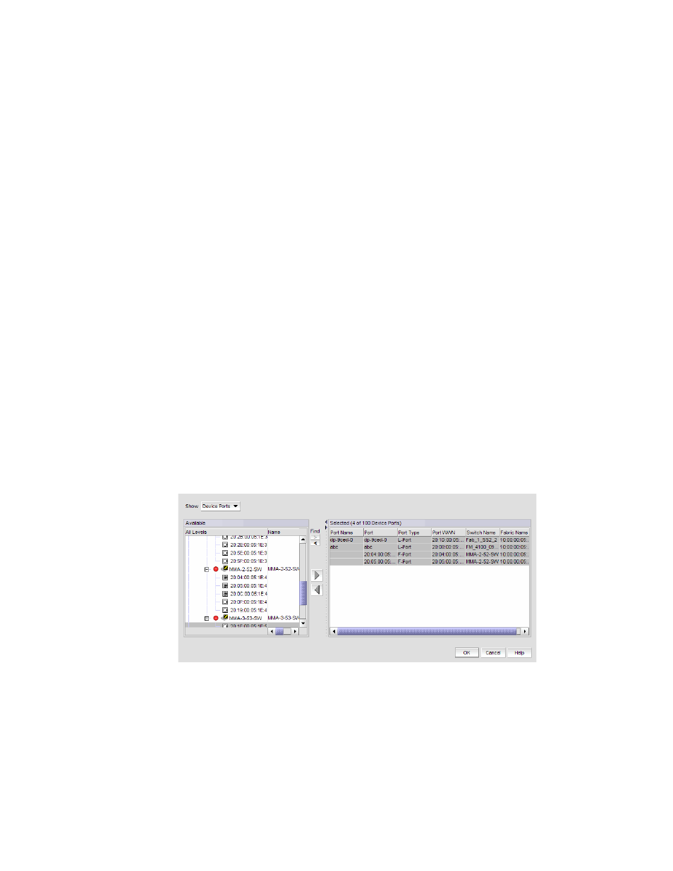
Filtering data by ports
To filter data for a historical performance graph by ports, complete the following steps.
1. Select Custom from the From list on the Historical Performance Graph dialog box.
The Custom Port Selector dialog box displays.
2. Select the type of ports from the Show list, as shown in
FIGURE 636
Custom Port Selector dialog box
3. Right-click a device in the Available list and select Expand All.