Using text, Chapter 7 – Apple Motion 3 User Manual
Page 565
7
565
7
Using Text
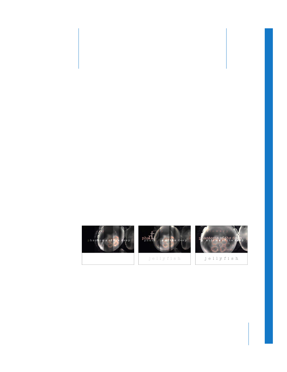
Text, one of the most essential motion graphics elements, is
more powerfully customizable than ever in Motion.
In motion graphics, typography communicates much more than just basic
information—titles, dates, and tag lines. Visual and kinetic type on the screen can also
provoke an immediate and often powerful emotional response. A title sequence can
set the mood of the film it introduces. A specific combination of text and animation
can instantly identify a broadcast network. And a clever television interstitial can
prevent a bored viewer from flipping channels during a commercial break. Type design
is an art form. Just look at the opening title sequence by Friz Freleng for Blake Edwards’
The Pink Panther. Freleng’s animated titles—featuring a design and graphics style that
holds up even today, more than 40 years later—not only set the comic tone for a film
franchise, it launched the (virtual) career of an animated icon (with a little help from
Henry Mancini’s suave theme music).
Although trends in type design change, the balanced use of type and graphics remains
the key to achieving the right effect in commercials, documentaries, television and film
titles, broadcast logos, corporate presentations, or your own personal video projects.
No matter what style your project requires, Motion provides unique text animation
tools that offer immediate results.