Change button appearances, Delete and disable appearances – Adobe InDesign CS5 User Manual
Page 569
563
USING INDESIGN
Interactive documents
Last updated 11/16/2011
By default, any button you create is defined with the Normal appearance containing the button’s text or image. When
you activate a new appearance, the Normal appearance is copied. To distinguish an appearance from the others, you
can change the color or add text or an image.
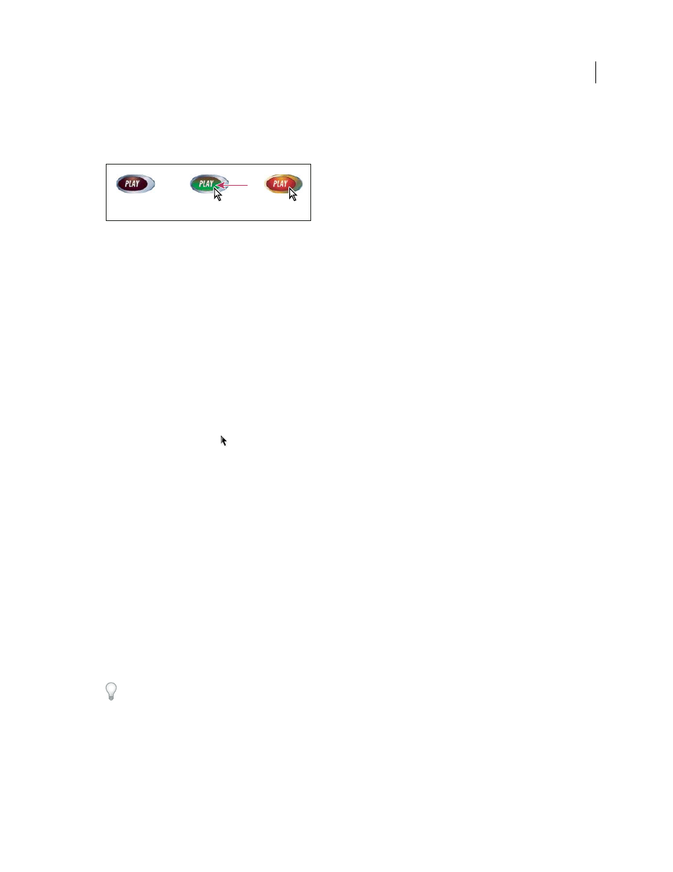
Button states
A. Pointer not over button area (Normal) B. Pointer enters button area (Rollover) C. Pointer clicks (Click)
Note: The clickable area, or hot spot, of the button is the square bounding box of the largest state in the button. For
example, a round button has a square hot spot.
Change button appearances
If you’re creating a button with multiple appearances (Normal, Rollover, and Click), it’s a good idea to finish designing
the button before you activate other appearances. When you activate the Rollover or Click appearance, the Normal
appearance is copied.
Some changes affect only the selected appearances, while other changes affect all active appearances. If you select an
appearance and apply a different background color or edit the text, the change affects only the selected appearance. If
you use the Selection tool to move or resize the button, the change affects all appearances.
1 Choose Window
> Interactive > Buttons to display the Buttons panel.
2 Using the Selection tool
, select the button in the layout that you want to edit.
3 Click [Rollover] to activate the Rollover appearance.
The Normal appearance is copied to Rollover.
4 With Rollover still selected, change the appearance of the button.
•
To change the color, choose a swatch from the Stroke or Fill menu in the Control panel.
•
To place an image in the appearance, select the existing image by using the direct selection tool or double-clicking
the existing button image, and then choose File
> Place and double-click a file.
•
To paste an image into a text frame, copy it to the Clipboard, select the appearance in the Buttons panel, and then
choose Edit > Paste Into.
•
To type text, select the Type tool, click the button, and type the text. You can also choose Edit > Paste Into to copy
a pasted text frame.
5 To add the Click appearance, click [Click] to activate it, and then follow the same procedure to change its
appearance.
6 Use the Preview panel to test the different button appearances.
To change the size of the State Appearance thumbnails in the Buttons panel, choose Panel Options from the Buttons
panel menu, select an option, and then click OK.
Delete and disable appearances
1 Select the appearance in the Buttons panel.
A
B
C