Line and character spacing, Set leading, Kern and track – Adobe Photoshop CS3 User Manual
Page 426
PHOTOSHOP CS3
User Guide
419
Line and character spacing
Set leading
The vertical space between lines of type is called leading (rhymes with sledding). For Roman type, leading is
measured from the baseline of one line of text to the baseline of the line above it. The baseline is the invisible line on
which most letters sit. You can apply more than one leading amount within the same paragraph; however, the largest
leading value in a line of type determines the leading value for that line.
Note: When working with horizontal Asian type, you can specify how leading is measured, either from baseline to
baseline or from the top of one line to the top of the next.
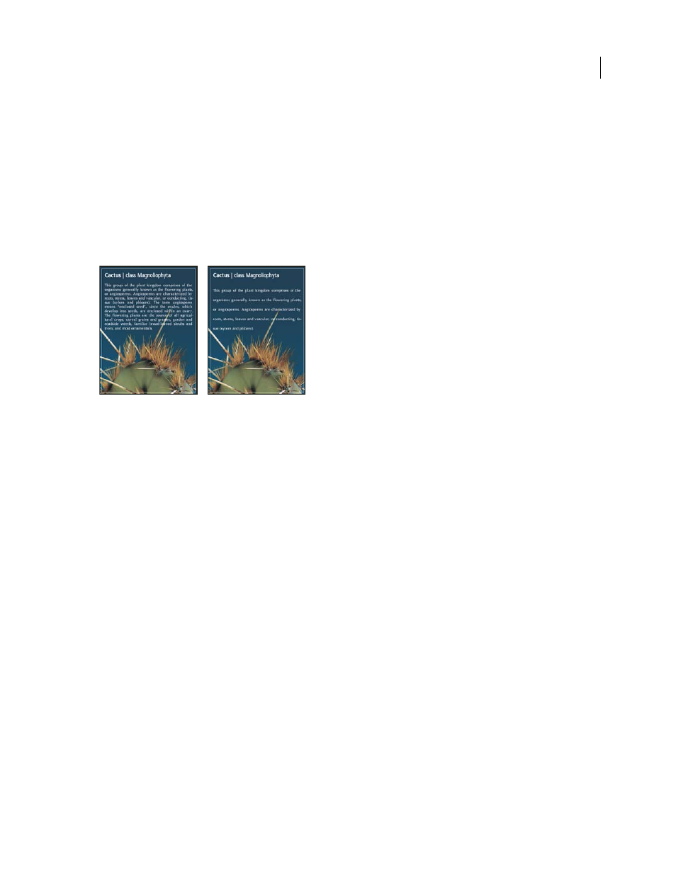
Five-point type with 6-point leading (left) and with 12-point leading (right)
See also
“About Asian type” on page 433
Set the leading
1
Select the characters you want to change. If you don’t select any text, the leading applies to new text you create.
2
In the Character palette, set the Leading value.
Change the default auto leading percentage
1
Choose Justification from the Paragraph palette menu.
2
For Auto Leading, enter a new default percentage.
Kern and track
Kerning is the process of adding or subtracting space between specific pairs of characters. Tracking is the process of
loosening or tightening the spacing between the characters in selected text or an entire block of text.
You can automatically kern type using metrics kerning or optical kerning. Metrics kerning (also called Auto kerning)
uses kern pairs, which are included with most fonts. Kern pairs contain information about the spacing of specific
pairs of letters. Some of these are: LA, P., To, Tr, Ta, Tu, Te, Ty, Wa, WA, We, Wo, Ya, and Yo. Metrics kerning is set
as the default so that specific pairs are automatically kerned when you import or type text.
Some fonts include robust kern-pair specifications. However, when a font includes only minimal built-in kerning or
none at all, or if you use two different typefaces or sizes in one or more words on a line, you may want to use the
optical kerning option. Optical kerning adjusts the spacing between adjacent characters based on their shapes.