Using text, Chapter – Apple Motion 2 User Manual
Page 453
7
453
7
Using Text
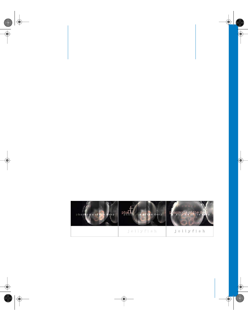
Text, one of the most essential motion graphics elements
and sometime savage beast, has just been taught to
“behave” in Motion.
In motion graphics, type has become more than words that provide basic information.
Type design has become an art form—a title sequence can set the mood of the film it
introduces; a certain combination of typeface and animation style can provide instant
recognition of the identity of a broadcast network, or a clever television interstitial can
keep a viewer from flipping channels during a commercial break. Just look what the
opening title sequence by Friz Freleng for Blake Edwards’ The Pink Panther did—from
movie title to movie and television star, with a design and graphics style that holds up
even today, nearly 40 years later (with the help of some very smart Henry Mancini
theme music). And, who wants to be in the popcorn line when any James Bond movie
begins? No one who knows what’s good for them.
Although trends in type design change, the balanced use of type and graphics remains
the key to achieving the right effect on the subject of commercials, documentaries,
television and film titles, broadcast identification, corporate presentations, or your own
personal video projects.
Fresh, funky, classy, cheeky... No matter what style your project requires, Motion
provides unique text animation tools that offer immediate results.
01112.book Page 453 Sunday, March 13, 2005 10:36 PM