Maple Systems MAPware-7000 User Manual
Page 177

MAPware-7000 Programming Manual
177
1010-1040, Rev. 02
o The right side of the State Properties box shows the configuration for the
highlighted state.
Display Text – option to display text on the button for that state.
Text – label applied to that particular state. Default text is ‘Word
Button’.
Font – the text attributes
Name- Type font used
Size: select font size
Bold: select ‘True’ to enable
Italic: select ‘True’ to enable
Underline: select ‘True’ to enable
Text Color – determines the text color. Click on the
button to display
the color palette and select a color.
Text Background Color – determines the fill or background color of the
state. Click on the
button to display the color palette and select a
color.
Button Style – options are Generic Square, Circle, Rounded Rectangle,
Invisible, User defined Images, or From Picture Library.
Button Border Style – the style or appearance of the button. Options are
Raised, Etched, Bump, Sunken, Frame, Flat and None.
Low Limit – enter the minimum value associated with this particular
state. Any value read from the target PLC address that is within the Low
Limit and High Limit will display this state.
High Limit – enter the maximum value associated with this particular
state
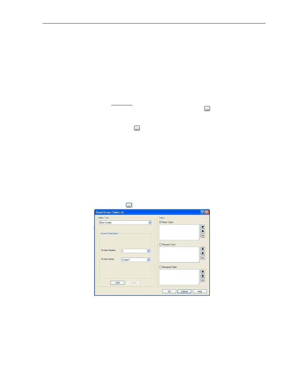
Tasks – this is the number of tasks performed whenever the button is
pressed. Click
to display the Touch Screen Tasks List.
To add tasks, perform the following steps:
In the Tasks section, select which touchscreen action you wish
to use for the task by clicking on the appropriate option.
Options are Press Tasks, Pressed Tasks, and Released Tasks.
o Press Tasks – tasks activate as soon as the touchscreen
object is touched or pressed. Tasks execute only once.
