Bio-Rad Quantity One 1-D Analysis Software User Manual
Page 166

Chapter 6. Standards and Band Matching
6-23
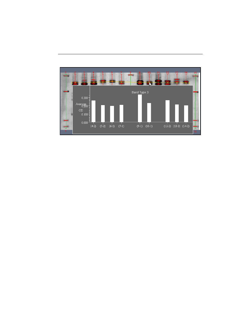
Fig. 6-17. Example of a match graph.
•
Average displays a histogram of the average densities of the bands in a band
type.
•
Calibrated Quantity displays a histogram of the quantities of the bands in a
band type as calculated from a calibration curve (see section 6.3, Quantity
Standards).
•
Contour displays a histogram of the intensity of each contoured band in a band
type. This function only works with contoured bands.
•
Normalized Quantity displays a histogram of the normalized quantities of the
bands in a band type. See section 6.2.d, Normalizing for Quantity, for
instructions on how to normalize for quantity.
•
Peak displays a histogram of the peak intensities of the bands in a band type.
•
Relative Quantity displays a histogram in which each bar represents the quantity
of the band in a lane as a percentage of either (1) the total intensity data in the
band’s lane, or (2) the total intensity of all the bands in the band’s lane. The
calculation method (% of Lane or % of Bands in Lane) is set in the Preferences
dialog.
•
Trace displays a histogram of the trace quantities of the bands in a band type
group.
