Brocade Network Advisor SAN User Manual v12.1.0 User Manual
Page 1056

1008
Brocade Network Advisor SAN User Manual
53-1002948-01
SAN connection utilization
29
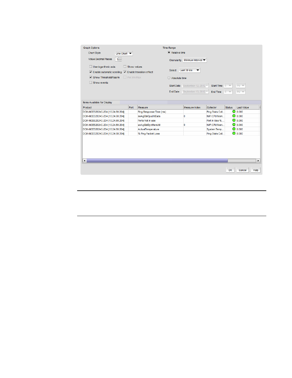
FIGURE 429
Graph Options dialog box (Historical Graphs/Tables dialog box)
NOTE
Figure 429
illustrates the Graph Options dialog box available from the Historical
Graphs/Tables dialog box. The Graph Options dialog box available from the Real Time
Graphs/Tables dialog box is similar, but has fewer control options.
2. Select the type of chart style from the Chart Style list.
Available chart styles include Line Chart, Area Chart, or Bar Chart.
3. Select the graph accuracy to up to three decimal places in the Value Decimal Places list.
4. Select from the following check boxes to define how polled data displays:
•
Use logarithmic axis check box — Data can be presented on a logarithmic or
non-logarithmic axis. Each unit in a non-logarithmic axis presents the data in equal
segments. However, logarithmic axis units are not equal and can increase exponentially by
10. Therefore, use a logarithmic axis if you have a large amount of data to view.
•
Show values check box — Annotates data point values in the graph.
•
Enable automatic scrolling check box — If new data is collected while the chart is in view,
the chart will automatically jump to display the new data.
•
Enable transition effect check box — The SNMP monitoring chart automatically adjusts the
range on the vertical axis so that all the data are contained within the view area when you
drag the chart into a different time range. Enabling this option provides an animated
smooth transition between the adjustments while the monitoring chart is being dragged or
any action that may cause the range of vertical axis to change.
•
Show Threshold/Rearm — Displays threshold and rearm events on the chart.
