Working with the spry validation checkbox widget – Adobe Dreamweaver CC 2014 v.13 User Manual
Page 306
Working with the Spry Validation Checkbox widget
About the Validation Checkbox widget
Insert and edit the Validation Checkbox widget
Customize Validation Checkbox widget error messages
Note: Spry widgets are replaced with jQuery widgets in Dreamweaver CC and later. While you can still modify existing spry widgets on your
page, you cannot add new spry widgets.
About the Validation Checkbox widget
A Spry Validation Checkbox widget is a check box or group of check boxes in an HTML form that display valid or invalid states when the user
selects or fails to select a check box. For example, you can add a Validation Checkbox widget to a form in which a user might be required to make
three selections. If the user fails to make all three selections, the widget returns a message stating that the minimum number of selections has not
been met.
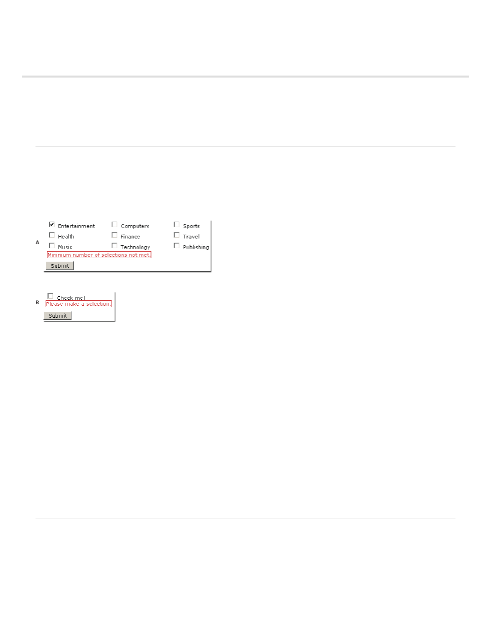
The following example shows a Validation Checkbox widget in various states:
A. Validation checkbox widget group, minimum number of selections state B. Validation Checkbox widget, required state
The Validation Checkbox widget includes a number of states (for example, valid, invalid, required value, and so on). You can alter the properties of
these states using the Property inspector, depending on the desired validation results. A Validation Checkbox widget can validate at various points
—for example, when the user clicks outside the widget, as the user makes selections, or when the user tries to submit the form.
Initial state The widget state when the page loads in the browser, or when the user resets the form.
Valid state The widget state when the user has made a selection, or the correct number of selections, and the form can be submitted.
Required state The widget state when the user has failed to make a required selection.
Minimum Number Of Selections state The widget state when the user has selected fewer than the minimum number of check boxes required.
Maximum Number Of Selections state The widget state when the user has selected more than the maximum number of check boxes allowed.
Whenever a Validation Checkbox widget enters one of these states through user interaction, the Spry framework logic applies a specific CSS class
to the HTML container for the widget at run time. For example, if a user tries to submit a form, but has made no selections, Spry applies a class to
the widget that causes it to display the error message, “Please make a selection.” The rules that control the style and display states of error
messages reside in the CSS file that accompanies the widget, SpryValidationCheckbox.css.
The default HTML for the Validation Checkbox widget, usually inside of a form, comprises a container tag that surrounds the
after the widget’s HTML markup.
For a more comprehensive explanation of how the Validation Checkbox widget works, including a full anatomy of the Validation Checkbox widget’s
code, see
.
Insert and edit the Validation Checkbox widget
Insert the Validation Checkbox widget
1. Select Insert > Spry > Spry Validation Checkbox.
2. Complete the Input Tag Accessibility Attributes dialog box and click OK.
Note: You can also insert a Validation Checkbox widget by using the Spry category in the Insert panel.
299