Customize the tabbed panels widget – Adobe Dreamweaver CC 2014 v.13 User Manual
Page 302
inspector (Window > Properties).
Change the order of panels
1. Select a Tabbed Panels widget in the Document window.
2. In the Panels menu of the Property inspector (Window > Properties), select the name of the panel you want to move.
3. Click the up or down arrows to move the panel up or down.
Set the default open panel
You can set which panel of the Tabbed Panels widget opens by default when the page opens in a browser.
1. Select a Tabbed Panels widget in the Document window.
2. In the Property inspector (Window > Properties), select the panel you want open by default from the Default panel pop-up menu.
Customize the Tabbed Panels widget
Although the Property inspector enables you to make simple edits to a Tabbed Panels widget, it does not support customized styling tasks. You
can alter the CSS rules for the Tabbed Panels widget and create a widget that is styled to your liking.
For a quick reference on changing the colors of the Tabbed Panels widget, see David Powers’s
For a more advanced list of styling tasks, see
.
All CSS rules in the topics below refer to the default rules located in the SpryTabbedPanels.css file. Dreamweaver saves the
SpryTabbedPanels.css file in the SpryAssets folder of your site whenever you create a Spry Tabbed Panels widget. This file also contains useful
commented information about various styles that apply to the widget.
Although you can easily edit rules for the Tabbed Panels widget directly in the accompanying CSS file, you can also use the CSS Styles panel
to edit the widget’s CSS. The CSS Styles panel is helpful for locating the CSS classes assigned to different parts of the widget, especially if
you use the panel’s Current mode.
Style Tabbed Panels widget text
You can style the text of a Tabbed Panels widget by setting properties for the entire Tabbed Panels widget container, or by setting properties for
the components of the widget individually.
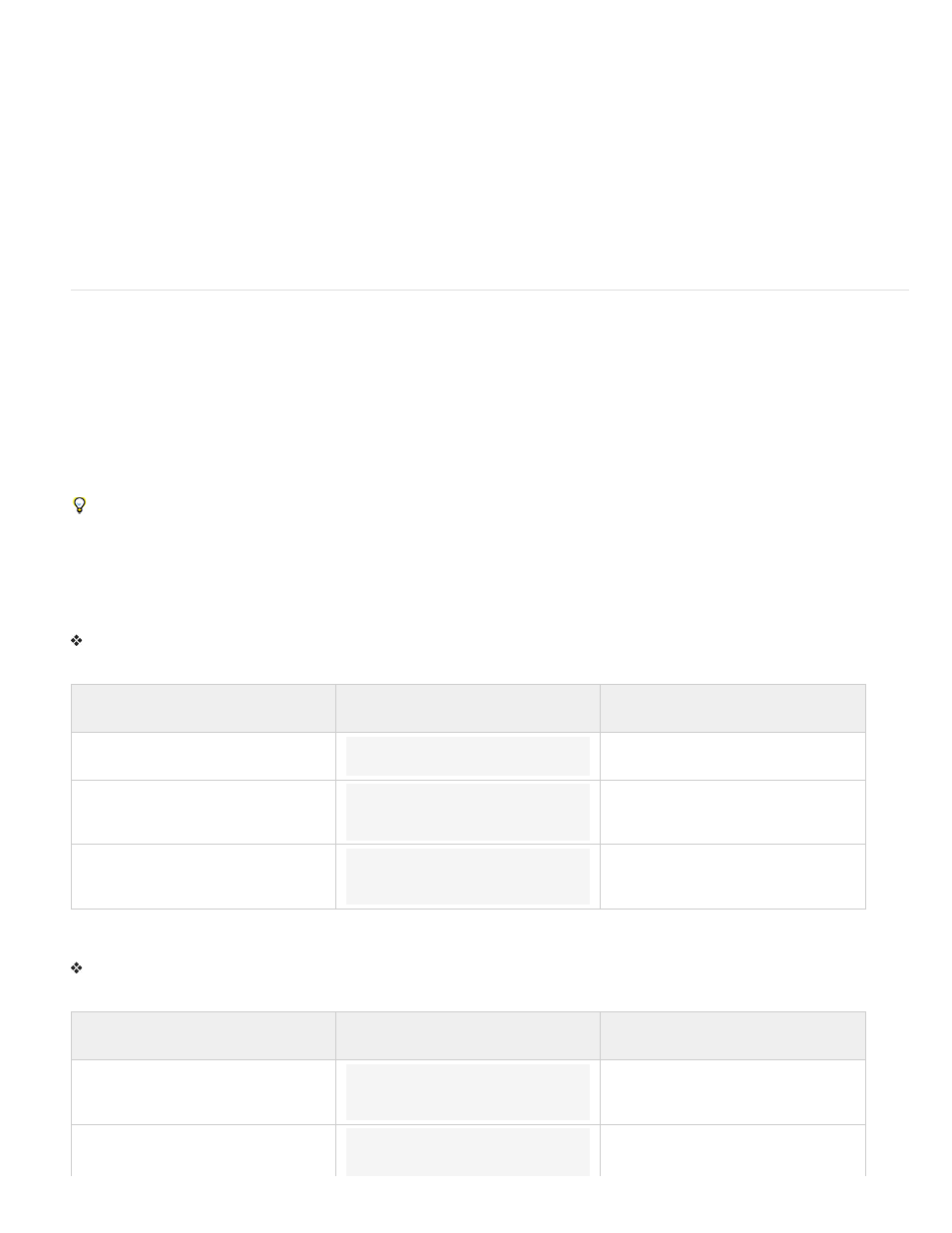
To change the text styling of a Tabbed Panels widget, use the following table to locate the appropriate CSS rule, and then add your own text
styling properties and values:
Text to change
Relevant CSS rule
Example of properties and values to
add
Text in the entire widget
.TabbedPanels
font: Arial; font-size:medium;
Text in panel tabs only
.TabbedPanelsTabGroup or
.TabbedPanelsTab
font: Arial; font-size:medium;
Text in content panels only
.TabbedPanelsContentGroup or
.TabbedPanelsContent
font: Arial; font-size:medium;
Change Tabbed Panels widget background colors
To change the background colors of different parts of a Tabbed Panels widget, use the following table to locate the appropriate CSS rule, and
then add or change background color properties and values to your liking:
Color to change
Relevant CSS rule
Example of property and value to add
or change
Background color of panel tabs
.TabbedPanelsTabGroup or
.TabbedPanelsTab
background-color: #DDD; (This is the
default value.)
Background color of content panels
.Tabbed PanelsContentGroup or
.TabbedPanelsContent
background-color: #EEE; (This is the
default value.)
295