Push button text and graphics – Rockwell Automation 2711-ND3 PanelBuilder v2.60 Software User Manual User Manual
Page 133
8–3
Creating Push Buttons
Publication 2711-6.0
Push buttons can have inner text and/or an inner graphic. Both
appear inside the push button and can change with each state. The
inner text or graphic is attached to the button. When you move or
delete the button, the inner text or graphic is also moved or deleted.
Push buttons are created with ST 0 as the default inner text. For
example, the default inner text for on/off push buttons is ST 0 and
ST 1. For multistate push buttons, the default inner text increments
from ST 0 to ST 15.
ON
ST 0
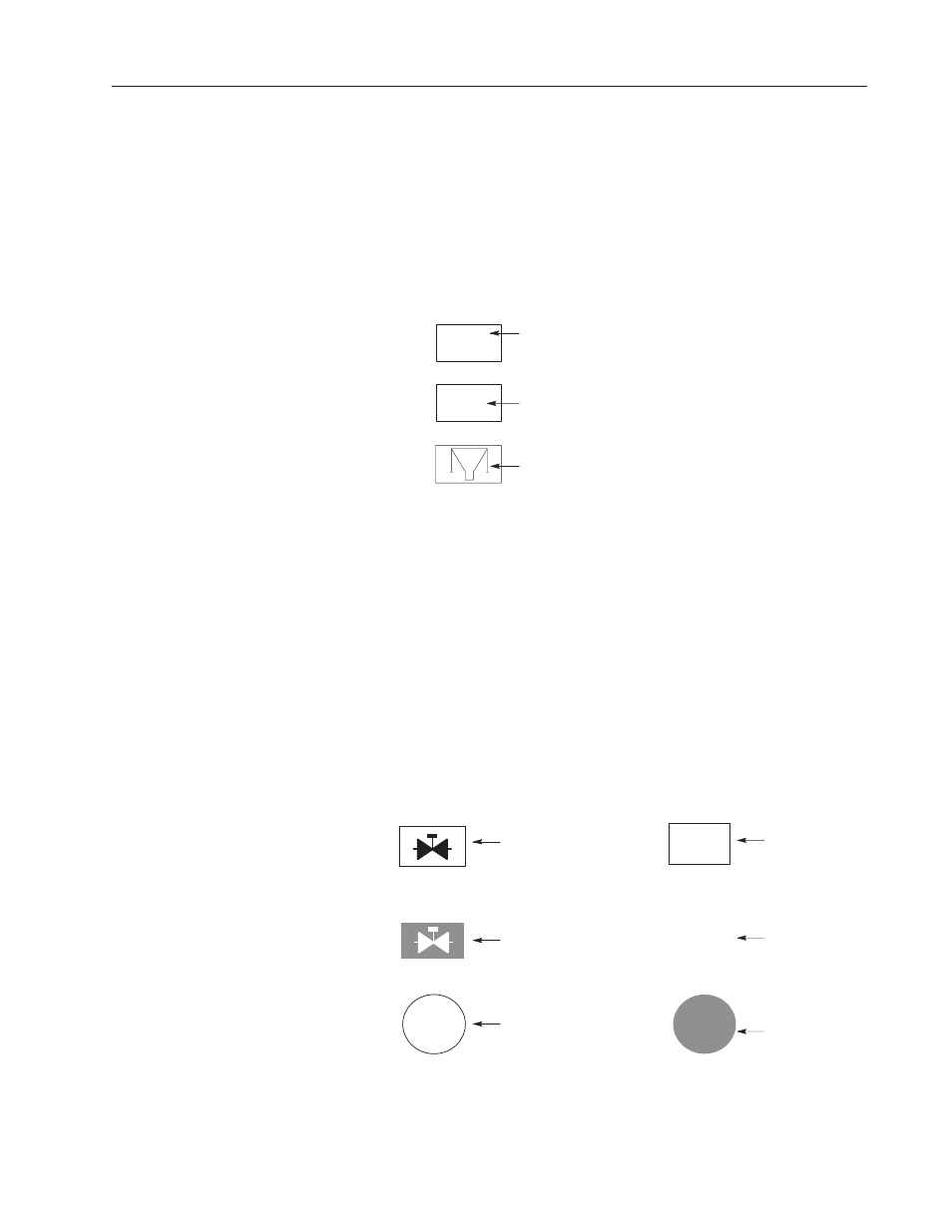
Default Inner Text
Inner Text
Inner Graphic
Inner text can also include a date, time or numeric variable.
Push buttons can have a variety of visual appearances. In addition to
text and graphics, you can format the button using options such as:
•
Fill pattern
•
Border type
•
Toggle foreground/background colors
•
Blinking
•
Shape
You can format each push button state directly from the States tab of
the object’s dialog or using the formatting procedures in Chapter 17.
Possible combinations are shown below.
RESET
ОООО
ОООО
ОООО
STOP
ПППП
ПППП
ПППП
MANUAL
MANUAL
Inner Graphic
Fill Pattern
Inner Graphic
Toggle Foreground/Background
Inner Text
Circular Button
Inner Text
Fill Pattern
Inner Text
No Border
White Fill Pattern
Inner Text
Circular Button
Toggle Foreground/Background
Push Button
Text and Graphics