Using axis titles, Showing data point labels – Apple Pages '08 User Manual
Page 210
210
Chapter 10
Using Charts
3
Choose one or more items from the Axes & Borders pop-up menu to select the items.
A selected item has a checkmark next to it; choose the item again to deselect it.
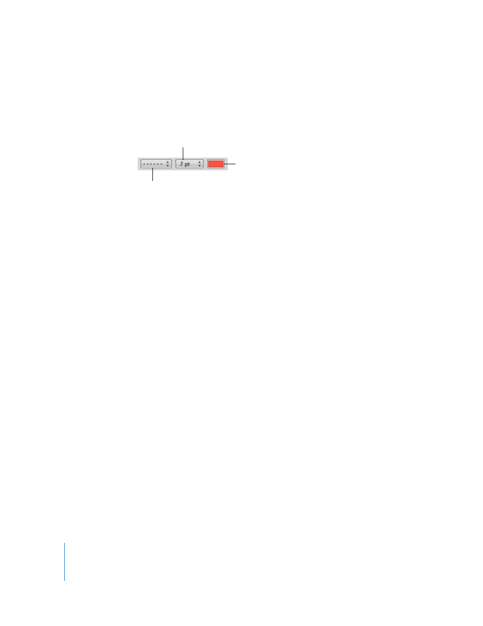
To format the border stroke and color, select the chart and use the controls on the left
side of the Format Bar.
Using Axis Titles
You can add a title to a chart’s X-axis and Y-axis. The title can be formatted.
Here are ways to work with an axis title:
m
To add an axis title, select the chart and then select Show Category Title from the X-
Axis or Show Value Title from the Y-Axis pop-up menu in the Axis pane of the Chart
Inspector. Replace the placeholder text with your title.
m
To format the title’s text, see “Formatting Titles, Labels, and Legends” on page 213.
m
To hide an axis title, select the chart and then deselect Show Category Title from the X-
Axis or Show Value Title from the Y-Axis pop-up menu in the Axis pane of the Chart
Inspector.
Showing Data Point Labels
You can display data point values on columns, bars, pie wedges, and other chart
elements of 2D and 3D charts.
To format data point labels:
1
Select the chart.
2
Click Inspector in the toolbar, click the Chart Inspector button, and click Series.
3
Choose Show Value from the Data Point Settings pop-up menu.
To display the value as a percentage or logarithmic value instead of an absolute value,
choose Percentage or Logarithmic in the X-Axis or Y-Axis pop-up menu on the Axis
pane.
For pie charts, you display values as percentages by choosing Show Pie Values as
Percentages from the Data Point Settings pop-up menu on the Series pane. To display
the data series name for a wedge, choose Show Series Name from the Data Point
Settings pop-up menu.
4
Select a label location from the Data Point Settings pop-up menu (for example, Middle
or Below Right).
Choose a line style.
Choose a line width.
Choose a line color.