Apple Pages '08 User Manual
Page 203
Chapter 10
Using Charts
203
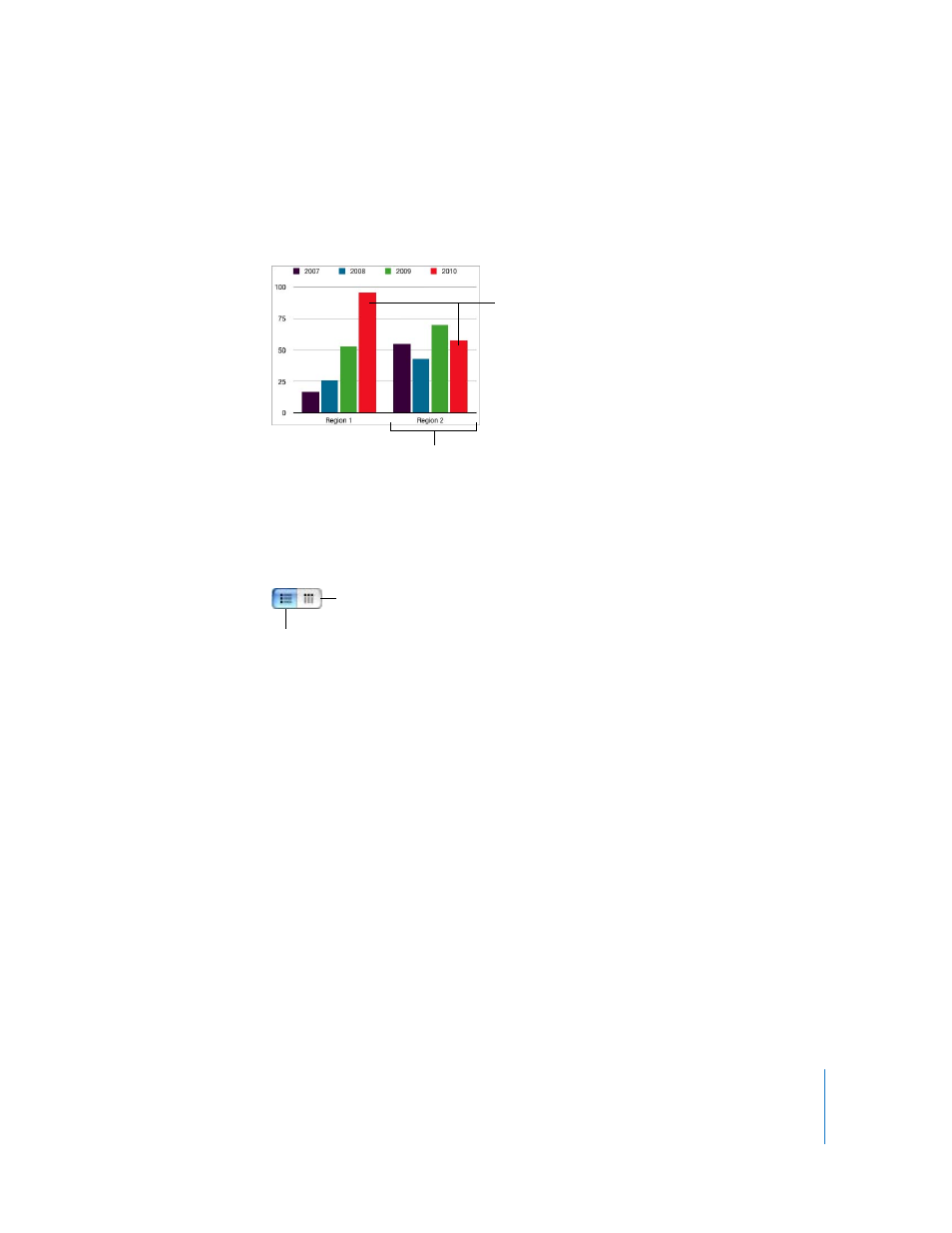
 Alternatively, you can change the chart orientation so that data points are grouped
by region rather than by year. In this case, the years are data series and the regions
are data sets. The bar chart would contain two groups of bars, one for Region 1 and
one for Region 2.
You can easily switch between using columns and rows as data series by using the Plot
Row vs. Column button in the Chart Data Editor.
Data series are represented differently in different kinds of charts:
 In column charts and bar charts, a data series is represented by a series of bars in the
same fill (color or texture).
 In a line chart (also called a graph), a data series is represented by a single line.
 In an area chart, a data series is represented by an area shape.
 In a pie chart, only a single data set (the first data point in each series) is represented
on the chart (whichever is listed first in the Chart Data Editor).
 In a scatter chart, two columns of data are used to plot values for a single data series.
Each pair of values determines the position of one data point.
These two bars represent
one data series.
The data sets contain one
data point (one bar) from
each of the four data series.
This button makes the rows
of data in the Chart Data
Editor the data series.
This button makes the
columns of data in the Chart
Data Editor the data series.