Retrotec USACE User Manual
Page 438

N8 ENERGY & PROCESS ASSESSMENT PROTOCOL
The graphs in Figure N5 show that heat consumption is almost indepen-
dent from outdoor temperature. Also no weekend setback was realized.
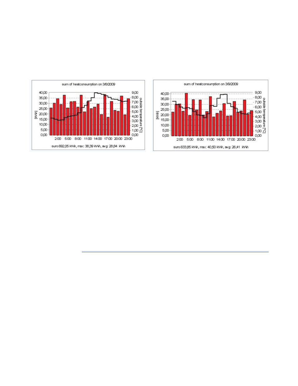
Hourly values compared to outdoor temperatures reveal even more detail.
The graphs in Figure N6 for instance reveal again that heating is nearly inde-
pendent from outdoor temperatures. In addition night setup is missing. Also
no correlation with occupancy is notable. Finally the hourly presentations indi-
cate that the control system does not work correctly.
Figure N6. Hourly heat consumption of the fl ight simulator building with outdoor temperatures. Left Sunday, right Monday.
Of course we can compare consumption with other quantities too. Which
to choose depends on the availability of measured data and our understanding
of the building operation and the building behavior.
If we increase time resolution as might be possible through the use of smart
meters, we can identify operation details from variable energy end-users, such
as computers, lighting, etc. If the measured values are plotted, a good picture
is given of how well the energy saving settings on the computers or the lighting
control work.
N.3.4 Comparison of yearly, monthly, daily or hourly data from
different units of one building – energy stoplights
To visualize user infl uences requires most simple visualizations. Among those
are visualizations that use only three colors are:
green for “good status”
■
yellow for “average status”
■
red for “status that has to be improved.”
■
We know these colors quite well from traffi c-c lights (stoplights) where green
means “go ahead,” yellow “caution,” and red “stop”.
