Change the appearance of a button’s states, Delete and disable states – Adobe InDesign CS4 User Manual
Page 558
550
USING INDESIGN CS4
Dynamic documents
Button states
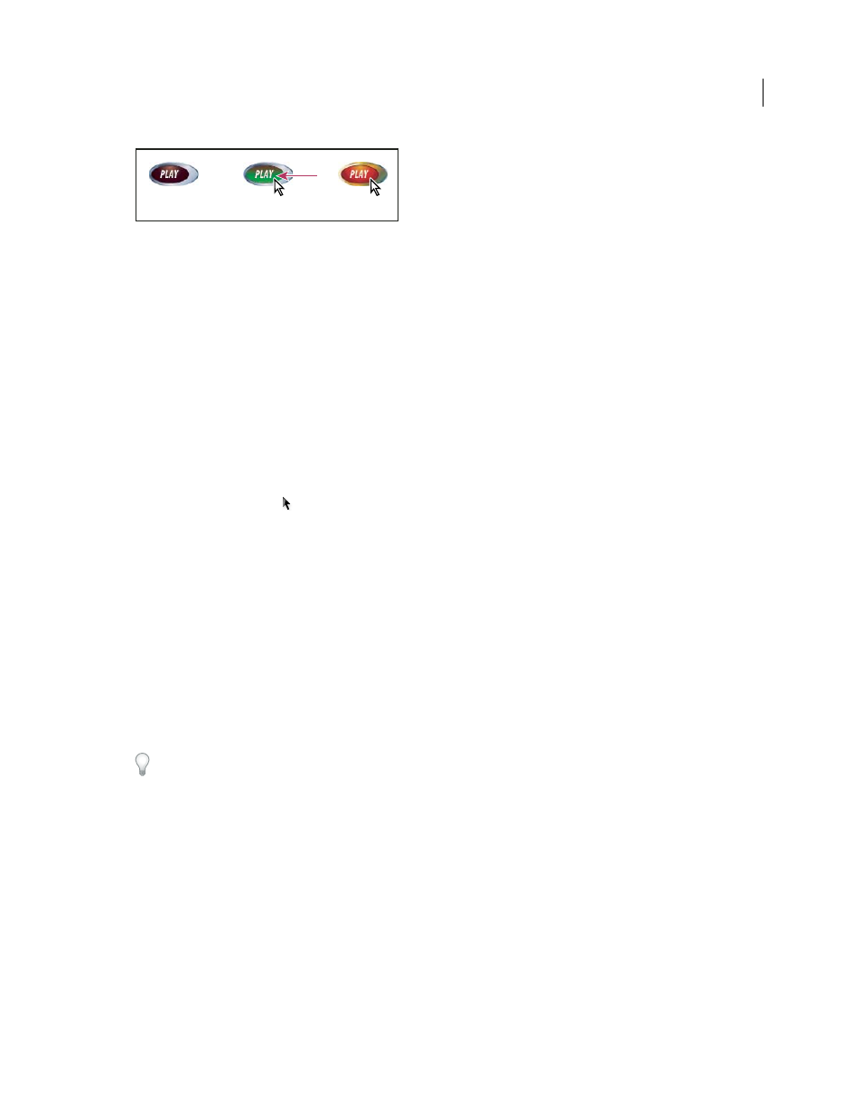
A. Pointer not over button area (Normal) B. Pointer enters button area (Rollover) C. Pointer clicks (Click)
Note: The clickable area, or hot spot, of the button is the square bounding box of the largest state in the button. For
example, a round button has a square hot spot.
Change the appearance of a button’s states
If you’re creating a button with multiples states, it’s a good idea to finish designing the button before you activate other
states. When you activate a state, the appearance of the Normal state is copied.
Some changes affect only the selected state, while other changes affect all active states. If you select a state and apply a
different background color or edit the text, the change affects only the selected state. If you use the Selection tool to
move or resize the button, the change affects all states. Keep in mind that each state is an object within the button
group. Use the Direct Selection tool to make changes only to the state, not to the whole group.
1 Choose Window
> Interactive > Buttons to display the Buttons panel.
2 Using the Selection tool
, select the button in the layout that you want to edit.
3 Click [Rollover] to activate the Rollover state.
The appearance of the Normal state is copied to the Rollover state.
4 With Rollover still selected, change the appearance of the button.
•
To change the color, click the Stroke or Fill icon in the toolbar, and then click a swatch color in the Swatches panel.
•
To place an image in the state, choose File
> Place and double-click a file.
•
To paste an image or a text frame, copy it to the Clipboard, select the state in the Buttons panel, and then choose
Edit > Paste Into.
•
To type text, select the Type tool, click the button, and type the text. You can also choose Edit > Paste Into to copy
a pasted text frame.
5 To add the Click state, click [Click] to activate it, and then follow the same procedure to change its appearance.
To change the size of the State Appearance thumbnails in the Buttons panel, choose Panel Options from the Buttons
panel menu, select an option, and then click OK.
To test the button, export the document to PDF or SWF, and view the exported file. If you’re exporting to PDF, make
sure that the Interactive Elements option is selected. If you’re exporting to SWF, make sure that Include Buttons is
selected.
Delete and disable states
1 Select the state in the Buttons panel.
The state selected in the States panel determines the content that appears in the button frame on the InDesign page.
Thumbnail icons in the States panel display the content of each state.
A
B
C
Updated 18 June 2009