Change the default leading percentage, Apply leading to whole paragraphs, Kerning and tracking – Adobe InDesign CS4 User Manual
Page 238: About kerning and tracking
230
USING INDESIGN CS4
Typography
If InDesign ignores the leading change, it may be due to Vertical Justification or Align To Baseline Grid being selected.
Choose Object > Text Frame Options and make sure Vertical Justification is set to Top, and make sure Do Not Align
To Baseline Grid is selected in the Paragraph panel, Control panel, or paragraph style.
You can also adjust vertical space by aligning text to the baseline grid. When baseline grid is set, the baseline grid
setting takes precedence over the leading value.
Change the default leading percentage
1 Select the paragraphs that you want to change.
2 Choose Justification from the Paragraph panel menu or from the Control panel menu.
3 For Auto Leading, specify a new default percentage. The minimum value is 0%, and the maximum value is 500%.
Apply leading to whole paragraphs
1 Choose Edit > Preferences
> Type (Windows) or InDesign
> Preferences
> Type (Mac
OS).
2 Select Apply Leading To Entire Paragraph, and then click OK.
Note: When you use a character style to apply leading to text, the leading affects only the text to which the style is applied,
not the entire paragraph, regardless of whether the Apply Leading To Entire Paragraph option is selected.
Kerning and tracking
About kerning and tracking
Kerning is the process of adding or subtracting space between specific pairs of characters. Tracking is the process of
loosening or tightening a block of text.
Types of kerning
You can automatically kern type using metrics kerning or optical kerning. Metrics kerning uses kern pairs, which are
included with most fonts. Kern pairs contain information about the spacing of specific pairs of letters. Some of these
are: LA, P., To, Tr, Ta, Tu, Te, Ty, Wa, WA, We, Wo, Ya, and Yo.
InDesign uses metrics kerning by default so that specific pairs are automatically kerned when you import or type text.
To disable metrics kerning, select "0".
Optical kerning adjusts the spacing between adjacent characters based on their shapes. Some fonts include robust
kern-pair specifications. However, when a font includes only minimal built-in kerning or none at all, or if you use two
different typefaces or sizes in one or more words on a line, you may want to use the optical kerning option.
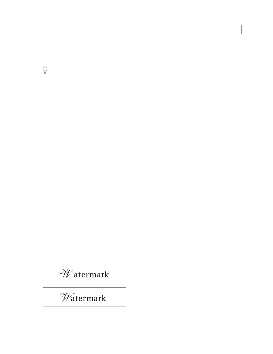
Before applying the optical kerning option to the “W” and “a” pair (top), and after (bottom)
Updated 18 June 2009