Apple Keynote '09 User Manual
Page 144
To show or hide an axis or chart borders, set the scale (linear or log) and span of the
value axis, or adjust grid and tick marks along the axes, make selections, and enter
appropriate values in the Axis pane of the Chart inspector.
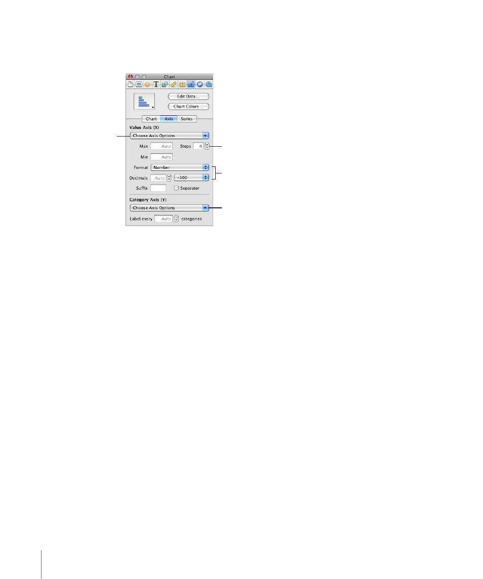
Set the range of values that
appear on the chart grid.
Select units for values in
the chart.
Set attributes of labels,
tick marks, and more.
Show or hide axes and chart
borders (2D charts only).
To open the Chart inspector:
Click Inspector in the toolbar (or choose View > Show Inspector) and click the Chart
m
inspector button.
To place gridlines and tick marks along the chart axes:
Select the grid lines and tick marks you want from one or both of the Choose Axis
m
Options pop-up menus.
To format the values along the value axis, do any of the following:
To set the highest number displayed on the value axis, type a number in the Maximum
m
field below Value Axis. This value cannot be lower than the maximum value of your
entire data set. If you don’t specify a number, the field displays the word “Auto,” and
the value is automatically calculated based on the data.
To set the value at the origin point of the value axis, type a number in the Minimum
m
field below Value Axis. This value cannot be greater than the minimum value of your
entire data set. If you don’t specify a number, the field displays the word “Auto,” and
the value is automatically calculated based on the data.
To specify the number of axis markings between zero and the minimum and maximum
m
values on the value axis, specify a number in the Steps field below Value Axis.
To display the data values on the value axis, select Show Value Labels or Show
m
Minimum Value from the Choose Axis Options pop-up menu below Value Axis.
To specify units for numbers on the value axis, choose an option from the Format pop-
m
up menu below Value Axis.
144
Chapter 9
Creating Charts from Data