Apple Pages '09 User Manual
Page 224

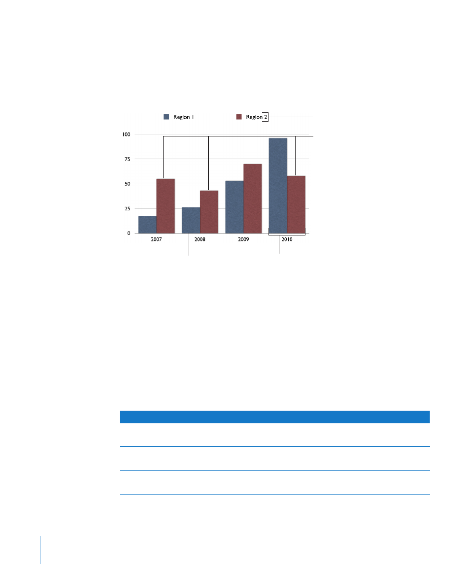
To give a different emphasis to your data, you can transpose the data so that data
points are grouped by region rather than by year. In this case, the data points for each
year are represented as a series of columns (data series; in this case each series has
only two data points and the groups of columns for each region are categories. So
this column chart contains two sets of four columns (data points), one category for
Region 1 and one data set for Region 2.
The chart legend denotes
the two data series.
Each data set contains two bars,
one from each data series.
These four bars of the
same color represent one
data series.
Each bar represents
one data point.
Data series are represented differently in different kinds of charts:
In
Â
column charts and bar charts, a data series is represented by a series of columns or
bars in the same fill color or texture.
In a
Â
line chart , a data series is represented by a single line.
In an
Â
area chart, a data series is represented by an area shape.
In a
Â
pie chart, only a single data set (the first data point in each series) is represented
on the chart (whichever is listed first in the Chart Data Editor).
In a
Â
scatter chart, each point on the graph is determined by both an x and a y value.
Two columns of values are plotted as x coordinates and y coordinates on a graph
representing the data points in a single data series.
To learn how to
Go to
Create and edit a chart
“Adding a New Chart and Entering Your Data” on
page 225
Format chart titles, legends, axes, and
other elements
“Formatting Charts” on page 228
Format pie charts, line charts, and other kinds
of charts
“Formatting Specific Chart Types” on page 237
224
Chapter 10
Creating Charts from Data
