Adjust the vertical alignment of type on a path, Adjust character spacing around sharp turns – Adobe Illustrator CS3 User Manual
Page 305
ILLUSTRATOR CS3
User Guide
299
Path type effects
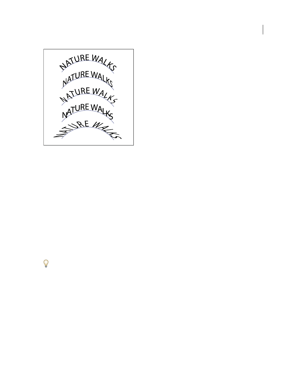
A. Rainbow B. Skew C. 3D Ribbon D. Stair Step E. Gravity
Adjust the vertical alignment of type on a path
1
Select the type object.
2
Choose Type > Type On A Path
> Type On A Path
Options.
3
Choose an option from the Align To Path menu to specify how to align all characters to the path, relative to a font’s
total height:
Ascender
Aligns along the font’s top edge.
Descender
Aligns along the font’s bottom edge.
Center
Aligns along the point halfway between the font’s ascender and descender.
Baseline
Aligns along the baseline. This is the default setting.
Note: Characters without ascenders or descenders (such as a letter e) or a baseline (such as an apostrophe) are vertically
aligned with characters that have ascenders, descenders, and baselines. These font dimensions are permanently specified
by the font designer.
For more control over vertical alignment, use the Baseline Shift option in the Character panel. For example, type a
negative value in the Baseline Shift text box to lower the type.
See also
“Shift the baseline” on page 314
Adjust character spacing around sharp turns
When characters flow around a sharp curve or acute angle, they fan out in such a way that there may appear to be
extra space between them. You can tighten the spacing of characters on curves using the Spacing option in the Type
On A Path Options dialog box.
1
Select the type object.
2
Choose Type > Type On A Path
> Type On A Path Options.
A
B
C
D
E