Insert the validation select widget – Adobe Dreamweaver CS3 User Manual
Page 480
DREAMWEAVER CS3
User Guide
473
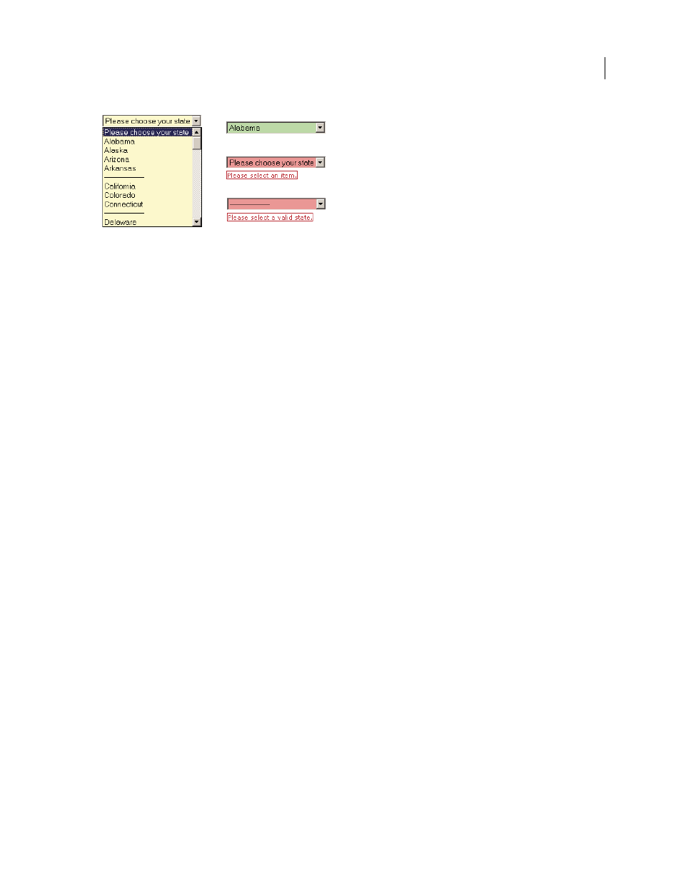
A. Validation Select widget in focus B. Select widget, valid state C. Select widget, required state D. Select widget, invalid state
The Validation Select widget includes a number of states (for example, valid, invalid, required value, and so on). You
can alter the properties of these states using the Property inspector, depending on the desired validation results. A
Validation Select widget can validate at various points—for example, when the user clicks outside the widget, as the
makes selections, or when the user tries to submit the form.
Initial state
The widget state when the page loads in the browser, or when the user resets the form.
Focus state
The widget state when the user clicks the widget.
Valid state
The widget state when the user has selected a valid item, and the form can be submitted.
Invalid state
The widget state when the user has selected an invalid item.
Required state
The widget state when the user has failed to select a valid item.
Whenever a Validation Select widget enters one of the above states through user interaction, the Spry framework
logic applies a specific CSS class to the HTML container for the widget at run time. For example, if a user tries to
submit a form, but has not selected an item from the menu, Spry applies a class to the widget so that it displays the
error message, “Please select an item.” The rules that control the style and display states of error messages reside in
the CSS file that accompanies the widget, SpryValidationSelect.css.
The default HTML for the Validation Select widget, usually inside of a form, comprises a container tag that
surrounds the
For a more comprehensive explanation of how the Validation Select widget works, including a full anatomy of the
Validation Select widget’s code, see
Insert the Validation Select widget
1
Select Insert > Spry > Spry Validation Select.
2
Complete the Input Tag Accessibility Attributes dialog box and click OK.
3
In Code view, add option tags that contain menu items and values. Dreamweaver does not do this for you
automatically. For more information, see the previous topic.
Note: You can also insert a Validation Select widget by using the Spry category in the Insert bar.
See also
“Create accessible HTML forms” on page 612
A
B
C
D
September 4, 2007