Working with the validation text field widget, About the validation text field widget – Adobe Dreamweaver CS3 User Manual
Page 471
DREAMWEAVER CS3
User Guide
464
Working with the Validation Text Field widget
About the Validation Text Field widget
A Spry Validation Text Field widget is a text field that displays valid or invalid states when the site visitor enters text.
For example, you can add a Validation Text Field widget to a form in which visitors type their e-mail addresses. If
they fail to type the “@” symbol and a period in the e-mail address, the widget returns a message stating that the
information the user entered is invalid.
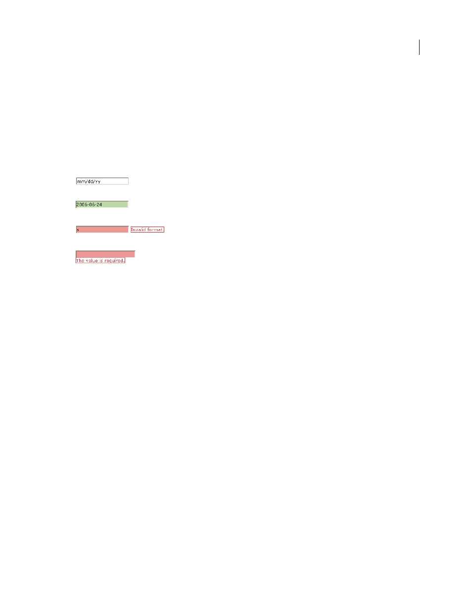
The following example shows a Validation Text Field widget in various states:
A. Textfield widget, hint activated B. Textfield widget, valid state C. Textfield widget, invalid state D. Textfield widget, required state
The Validation Text Field widget includes a number of states (for example, valid, invalid, required value, and so on).
You can alter the properties of these states using the Property Inspector, depending on the desired validation results.
A Validation Text Field widget can validate at various points—for example, when the visitor clicks outside the widget,
when they type, or when they try to submit the form.
Initial state
The widget state when the page loads in the browser, or when the user resets the form.
Focus state
The widget state when the user places the insertion point in the widget.
Valid state
The widget state when the user has entered information correctly, and the form can be submitted.
Invalid state
The widget state when the user has entered text in an invalid format. (For example, 06 for a year instead
of 2006).
Required state
The widget state when the user has failed to enter required text in the text field.
Minimum Number Of Characters state
The widget state when the user has entered fewer than the minimum number
of characters required in the text field.
Maximum Number Of Characters state
The widget state when the user has entered greater than the maximum
number of characters allowed in the text field.
Minimum Value state
The widget state when the user has entered a value that is less than the value required by the
text field. (Applies to integer, real, and data type validations.)
Maximum Value state
The widget state when the user has entered a value that is greater than the maximum value
allowed by the text field. (Applies to integer, real, and data type validations.)
Whenever a Validation Text Field widget enters one of these states through user interaction, the Spry framework
logic applies a specific CSS class to the HTML container for the widget at run time. For example, if a user tries to
submit a form, but has entered no text in a required text field, Spry applies a class to the widget that causes it to
display the error message, “A value is required”. The rules that control the style and display states of error messages
exist in the CSS file that accompanies the widget, SpryValidationTextField.css.
A
B
C
D
September 4, 2007