Working with the collapsible panel widget, About the collapsible panel widget – Adobe Dreamweaver CS3 User Manual
Page 465
DREAMWEAVER CS3
User Guide
458
Change the dimension of menu items
You change the dimension of menu items by changing the width properties of the menu item’s
li
and
ul
tags.
1
Locate the
ul.MenuBarVertical li
or
ul.MenuBarHorizontal li
rule.
2
Change the width property to a desired width (or change the property to
auto
to remove a fixed width, and add
the property and value
white-space: nowrap;
to the rule).
3
Locate the
ul.MenuBarVertical ul
or
ul.MenuBarHorizontal ul
rule.
4
Change the width property to a desired width (or change the property to
auto
to remove a fixed width).
5
Locate the
ul.MenuBarVertical ul li
or
ul.MenuBarHorizontal ul li
rule:
6
Add the following properties to the rule:
float: none;
and
background-color: transparent;
.
7
Delete the
width: 8.2em;
property and value.
Position submenus
The position of Spry Menu Bar submenus is controlled by the margin property on submenu
ul
tags.
1
Locate the
ul.MenuBarVertical ul
or
ul.MenuBarHorizontal ul
rule.
2
Change the
margin: -5% 0 0 95%;
default values to the desired values.
Working with the Collapsible Panel widget
About the Collapsible Panel widget
A Collapsible Panel widget is a panel that can store content in a compact space. Users hide or reveal the content
stored in the Collapsible Panel by clicking the tab of the widget. The following example shows a Collapsible Panel
widget, expanded and collapsed:
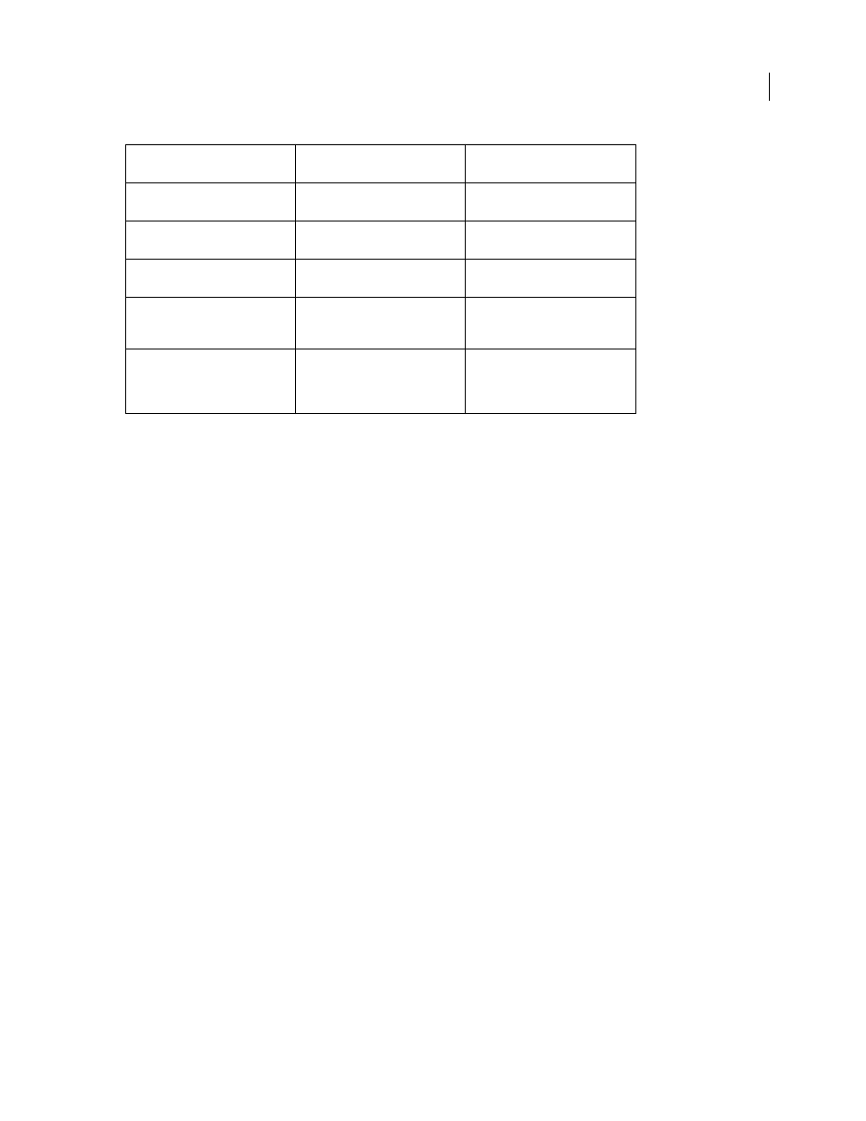
Color to change
CSS rule for vertical or horizontal
menu bar
Relevant properties and default
values
Default background
ul.MenuBarVertical a, ul.MenuBarHo-
rizontal a
background-color: #EEE;
Background color when mouse
pointer moves over it
ul.MenuBarVertical a:hover,
ul.MenuBarHorizontal a:hover
background-color: #33C;
Background color when in focus
ul.MenuBarVertical a:focus,
ul.MenuBarHorizontal a:focus
background-color: #33C;
Menu Bar item color when mouse
pointer moves over it
ul.MenuBarVertical a.MenuBarItem-
Hover, ul.MenuBarHorizontal
a.MenuBarItemHover
background-color: #33C;
Submenu item color when mouse
pointer moves over it
ul.MenuBarVertical a.MenuBarItem-
SubmenuHover, ul.MenuBarHori-
zontal a.MenuBarItemSubmenu-
Hover
background-color: #33C;
September 4, 2007