Adjusting the opacity of bar and column charts, Area charts and line charts – Apple Keynote '08 User Manual
Page 160
160
Chapter 8
Using Charts
Adjusting the Opacity of Bar and Column Charts
You can change the opacity of the chart and individual chart elements, such as the
legend. See “Adjusting Opacity” on page 77 for more information.
Area Charts and Line Charts
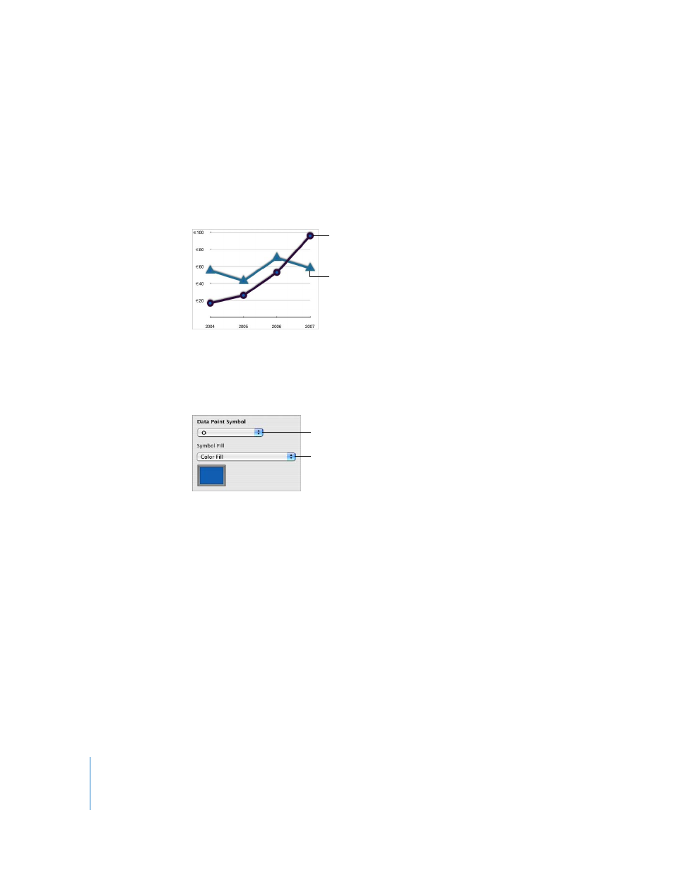
In area and line charts, you can use symbols (circles, triangle, squares, and diamonds) to
represent data points.
Here are ways to format area charts and line charts:
m
To format symbols, select a data series (area shape or line), click Inspector in the
toolbar, click the Chart Inspector button, and then click Series. Choose a symbol from
the Data Point Symbol pop-up menu.
Use the options on the Symbol Fill pop-up menu to add color or images to the
symbols. See “Filling an Object with an Image” on page 81 and “Filling an Object with
Color” on page 79 for instructions.
m
To set the line color in line charts, select a line, click Inspector in the toolbar, click the
Graphic Inspector button, and then use the Stroke controls. See “Changing the Style of
Borders” on page 74 for instructions.
m
To add shadows to line or area charts, select a data series (area shape or line), click
Inspector in the toolbar, click the Graphic Inspector button, and then use the Shadow
controls. See “Adding Shadows” on page 76 for instructions.
The data points in this
series are represented
by circles.
The data points in this
series are represented
by triangles.
Choose a symbol to use
for data points.
Fill data point symbols
with color or images.