Bar and column charts, Adjusting spacing of bar and column charts, Adding shadows to bar and column charts – Apple Keynote '08 User Manual
Page 159
Chapter 8
Using Charts
159
Bar and Column Charts
You can apply shadows to individual data series or to the entire chart. You can adjust
the opacity for the chart as a whole or for individual series (but not individual bars). You
can also adjust the spacing between data sets or individual bars.
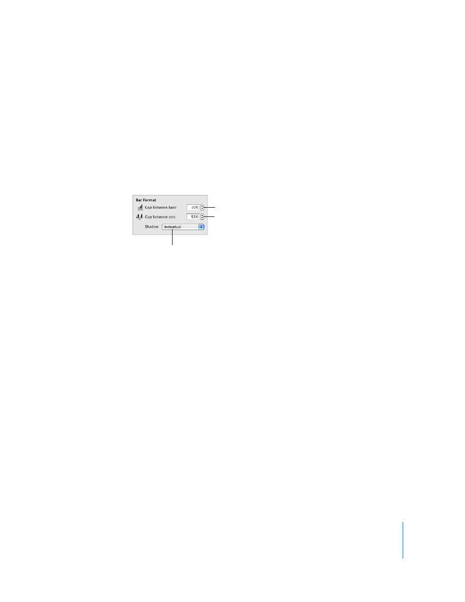
Adjusting Spacing of Bar and Column Charts
You can adjust spacing between individual bars or data sets.
To adjust spacing:
1
Select the chart.
2
Click Inspector in the toolbar, click the Chart Inspector button, and then click Series.
3
To change the space between bars, type a value (or click the arrows) in the “Gap
between bars” field.
To change the space between data sets, specify a value in the “Gap between sets” field.
The value is the percentage of the bar thickness. Decreasing the space between the
bars makes them thicker.
You can also move the pointer near a bar edge until it becomes a double-headed
arrow, then drag to make the bars thicker or thinner.
Adding Shadows to Bar and Column Charts
You can add shadows to each bar in the chart or to each group of bars.
If you want to add shadows to individual bars, it’s a good idea to separate them first.
See “Adjusting Spacing of Bar and Column Charts” on page 159 for instructions.
To add shadows:
1
Select the chart.
2
Click Inspector in the toolbar, click Chart Inspector, and then click Series.
3
To add shadows to individual bars, choose Individual from the Shadow pop-up menu.
To add shadows to each group of bars, choose Group from the Shadow pop-up menu.
4
To set shadow attributes, use the Graphic Inspector. See “Adding Shadows” on page 76
for instructions.
Separate the individual
bars in the chart.
Separate the data sets
in the chart.
Add shadows to bars
or data sets.