Apple Keynote '08 User Manual
Page 145
Chapter 8
Using Charts
145
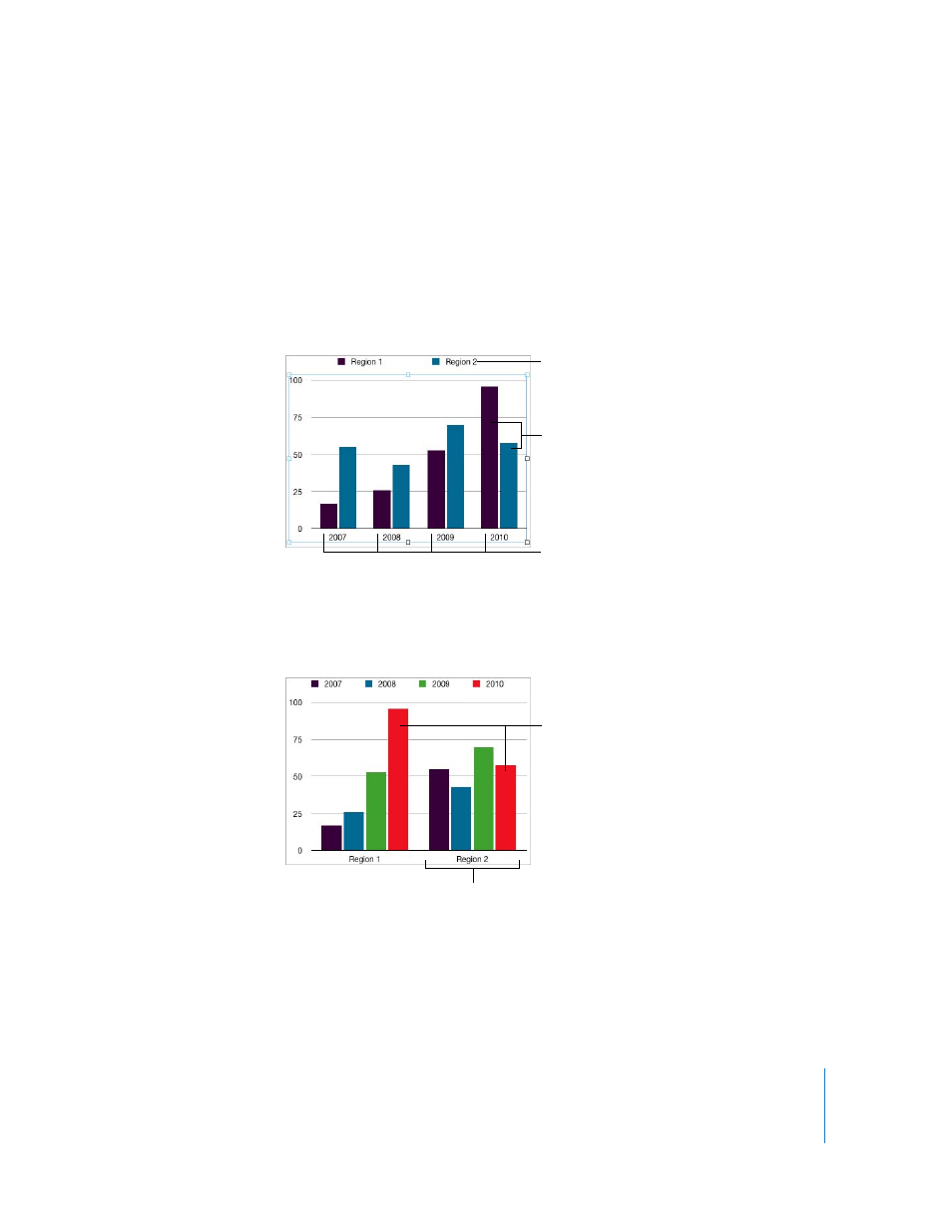
There are several ways to represent this data in a chart. In a bar chart, for example:
 You can plot 2007 employee counts for Region 1 and Region 2 in side-by-side bars,
followed by pairs of bars for 2008, 2009, and 2010. Such a chart would have two data
series and four data sets.
Region 1 and Region 2 are called data series; each region is represented by a series of
data values. Data values (data points) for each region are represented by bars that are
grouped side by side in the chart; each group is called a data set (2007 is a data set,
2008 is a data set, and so on).
 Alternatively, you can change the chart orientation so that data points are grouped
by region rather than by year. In this case, the years are data series and the regions
are data sets. The bar chart would contain two groups of bars, one for Region 1 and
one for Region 2.
The chart legend denotes
the two data series.
The data sets contain one
data point (one bar) from
each of the data series.
These four bars represent
one data series.
These two bars represent
one data series.
The data sets contain one
data point (one bar) from
each of the four data series.