Enter data sets for pie graphs – Adobe Illustrator CC 2015 User Manual
Page 532
527
Graphs
Last updated 6/5/2015
• Enter data-set labels in every other cell along the top row of the worksheet, starting with the first cell. These labels
will appear in the legend.
• Enter y-axis data in the first column and x-axis data in the second column.
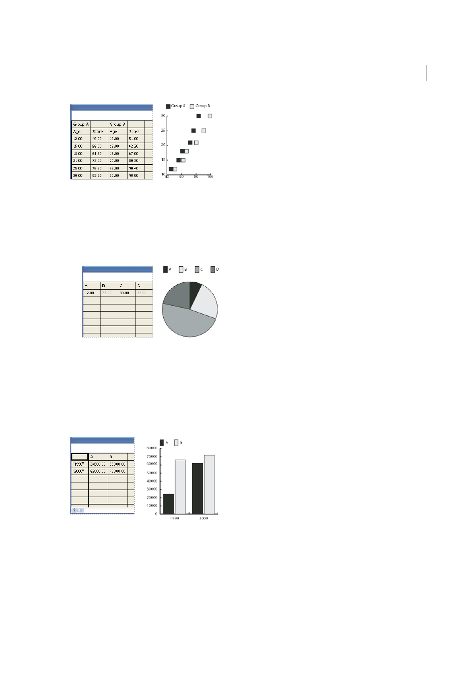
Enter data sets for pie graphs
You organize data sets for pie graphs similarly to other graphs. However, each row of data in the worksheet generates a
separate graph.
• Enter data-set labels as for column, stacked column, bar, stacked bar, line, area, and radar graphs. Enter category
labels if you want to generate graph names.
• To create a single pie graph, plot only one row of data, either all positive or all negative values.
• To create multiple pie graphs, plot additional rows of data, either all positive or all negative values. By default, the
size of the individual pie graphs is proportional to the total of each graph’s data.
Enter data sets for column, bar, line, area, and radar graphs
After you enter the labels for your graph, you’re ready to enter each set of data under the appropriate column.
Column, stacked column, bar, stacked bar graphs
The height of the column or length of the bar corresponds to the
amount being compared. For column or bar graphs, you can combine positive and negative values; negative values
appear as columns extending below the horizontal axis. For stacked column graphs, numbers must be all positive or all
negative.
Line graphs
Each column of data corresponds to one line in the line graph. You can combine positive and negative
values in a line graph.