Scatter plot, Right-click menu options, Data spreadsheet – Bio-Rad Firmware & Software Updates User Manual
Page 132: Settings
CFX96 Touch, CFX96 Touch Deep Well, CFX Connect, and CFX384 Touch Systems Instruction Manual
119
Right-Click Menu Options
Right-click on the clustergram to select the items shown in Table 40.
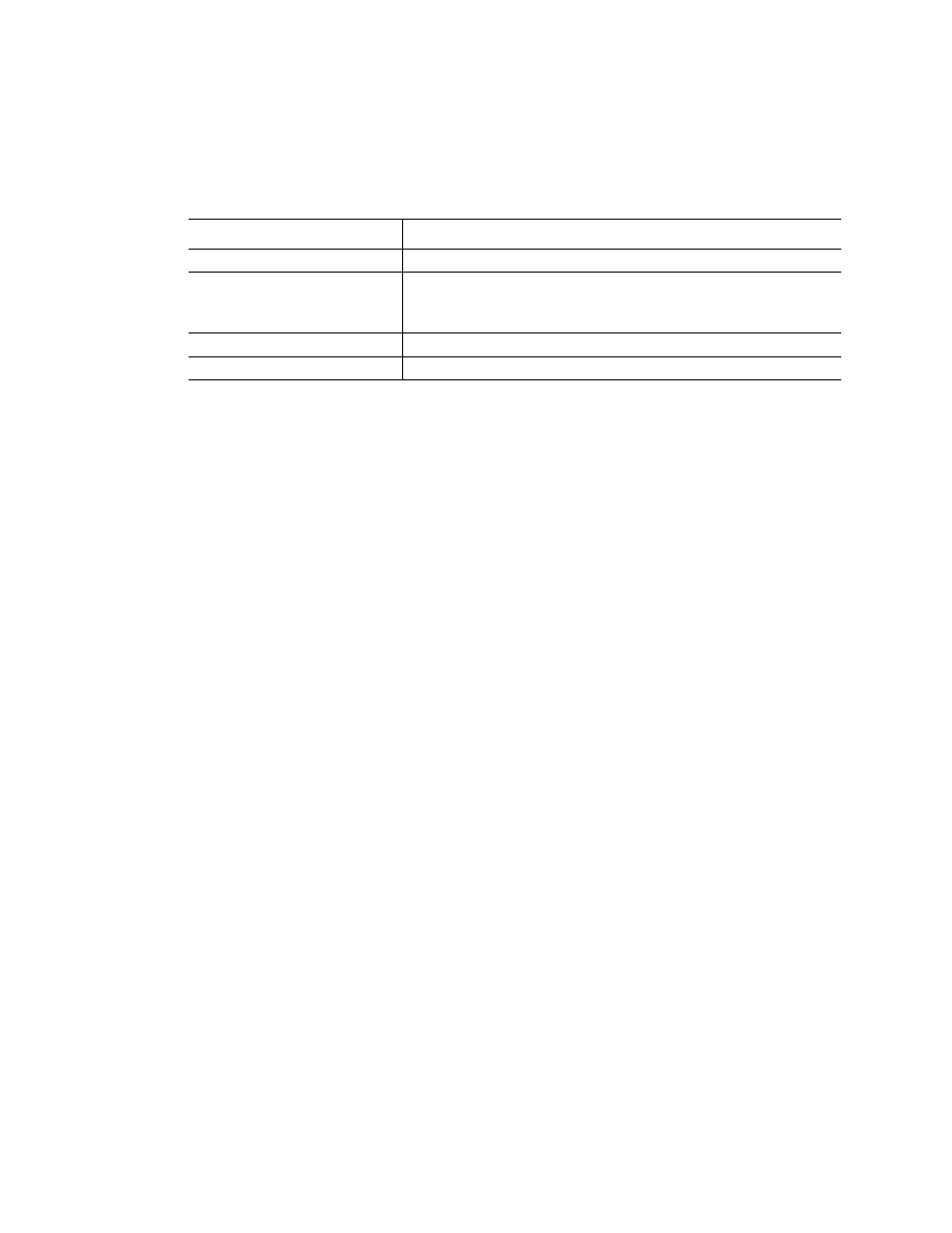
Table 40. Right-click menu items.
Data Spreadsheet
The spreadsheet lists the target, sample, and normalized expression. Click the checkbox
adjacent to a target to include or exclude it from the clustergram. Select chart options by right-
clicking.
Scatter Plot
The scatter plot shows the normalized expression of targets for a control versus an
experimental sample.
The plot image shows the following changes in target expression based on the threshold set:
•
Upregulation (red circle). Relatively higher expression
•
Downregulation (green circle). Relatively lower expression
•
No change (black circle)
Click and drag either threshold line to adjust the regulation threshold value.
TIP: To change the symbol used for a scatter or volcano plot, choose Symbol from
the right-click menu and select one from the options presented.
Settings
The following can be set:
•
Control Sample
•
Experimental Sample
•
Regulation Threshold. As this value is altered, the threshold lines in the plot will be
moved appropriately
Right-Click Menu Options
Right-click on the scatter plot to select the items shown in Table 41.
Item
Function
Copy
Copy the chart to a clipboard
Save Image As...
Save the graph in the chart view as an image file. The file type
options are PNG, GIF, JPG, TIF, or BMP. The image resolution
will be the same as the computer display
Print...
Print the chart view
Color Scheme
Choose Red/Green or Red/Blue for the chart colors