Melt curve data tab – Bio-Rad Firmware & Software Updates User Manual
Page 106
CFX96 Touch, CFX96 Touch Deep Well, CFX Connect, and CFX384 Touch Systems Instruction Manual
93
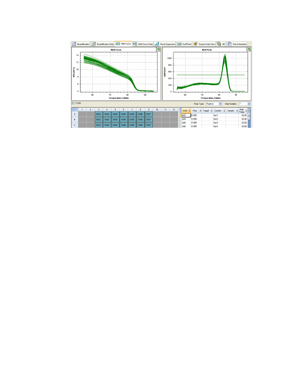
Figure 68. Layout of the Melt Curve tab in the Data Analysis window.
Adjust the Melt Curve data by any of these methods:
•
Click and drag the threshold bars in the Melt Peak chart to include or exclude peaks
in data analysis
•
Select Positive in the Peaks pull-down menu to show the spreadsheet data for the
peaks above the Melt Threshold line or select Negative to view the spreadsheet data
for the peaks below the Melt Threshold line
•
Open the Trace Styles window to change the color of the traces in the Melt Curve
and Melt Peak charts
•
Select a number in the Step Number selector (page 75) to view the Melt Curve data
at another step in the protocol. The list shows more than one step if the protocol
includes plate read (camera icon) in two or more melt curve steps
•
Select wells in the well selector to focus on subsets of the data
•
Select a well group (page 75) to view and analyze a subset of the wells in the plate.
Select each well group by name in the Well Group pull-down menu in the toolbar
Melt Curve Data Tab
The Melt Curve Data tab shows the data from the Melt Curve tab in multiple spreadsheets that
include all the melt peaks for each trace. Select one of these four options to show the melt
curve data in different spreadsheets:
•
Melt Peaks. List all the data, including all the melt peaks, for each trace
•
Plate. List a view of the data and contents of each well in the plate
•
RFU. List the RFU quantities at each temperature for each well
•
-d(RFU)/dT. List the negative rate of change in RFU as the temperature (T) changes. This
is a first regression plot for each well in the plate