1 ring plot color coding, 2 ring plot units of measure, 5 launching the performance dashboard tool – HP Insight Control Software for Linux User Manual
Page 176: Figure 34

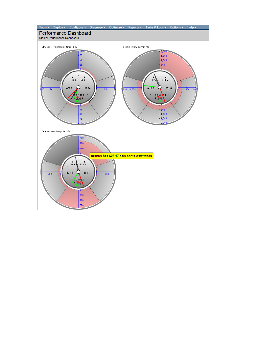
Figure 34 Monitoring three metrics using Performance Dashboard
20.8.4.1 Ring plot color coding
The colors that the Performance Dashboard ring plot segments use represent the following:
•
Light Gray means that a managed system is actively reporting data.
•
Pink represents the actual value of the metric.
•
Dark Gray means that a managed system is not reporting data and might be down. In that
case, select the Left Mouse on the managed system to launch the Nagios application focused
on that managed system to investigate further.
20.8.4.2 Ring plot units of measure
If a metric's unit of measure is a percentage, as is the case for the CPU load metric, the ring plot
starts at 0 (zero) and ends at 100 percent.
If a metric's unit of measure is something other than a percentage, such as Megabytes or days,
the ring plot scale starts at 0 (zero) and ends with the maximum value reported by all the monitored
managed systems.
20.8.5 Launching the Performance Dashboard tool
1.
Select the following menu item from the Insight Control user interface:
Tools
→Integrated Consoles→Performance Dashboard...
176
Using graphical tools to monitor managed systems
