Adobe Digital Publishing Suite User Manual
Page 54
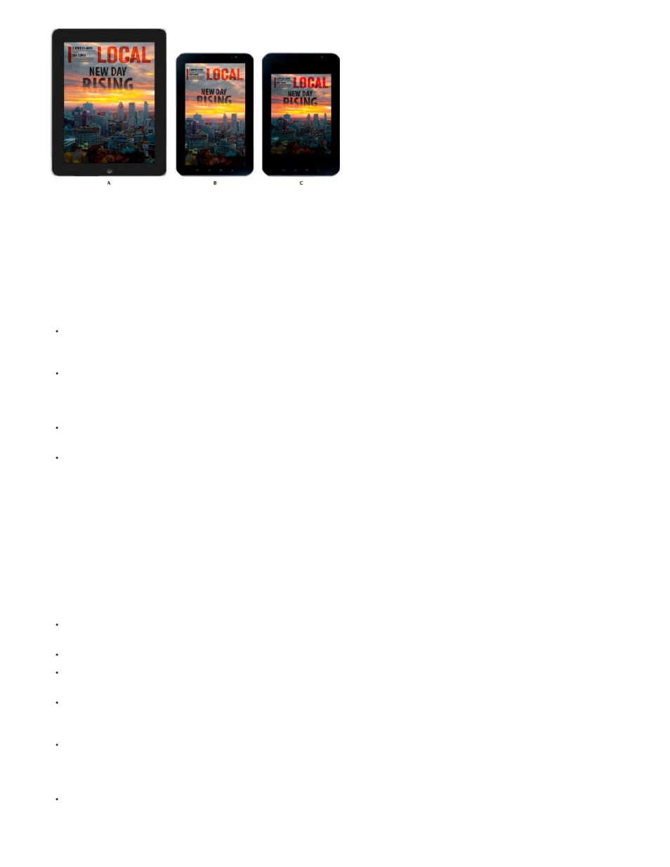
Folio renditions
A. 1024x768 folio B. 1024x600 folio C. 1024x768 folio letterboxed on 1024x600 device
Rendition options
You can use a number of different methods to account for the different device dimensions:
Create a single folio size (such as 1024x768) for the iPad. Layouts are scaled down or letterboxed as needed on Android devices. If you
want your content to appear on the iPhone as well as the iPad, you need to create at least one additional folio size, such as 480x320. iPad
folios do not appear in iPhone viewers.
Create separate source documents for multiple target devices. Create a different folio rendition for each set of source documents. For
example, to create folio renditions for an Android viewer app, you could create folios and source files using 1024x600, 1280x800, and
1920x1200 sizes. However, this approach requires additional production work and is no longer necessary now that Android viewers scale
content. See
For iPads or iPhones, create multi-rendition PDF articles that display different assets depending on whether the device is SD or HD. See
Creating multi-rendition PDF articles for iOS devices.
Use the same source documents, but create different folio renditions for multiple target mobile devices. For example, for the iPad, you can
create one set of 1024x768 source documents, and then create two folios based on these documents. When the articles are uploaded, the
source files are scaled according to the folio size. Scaling content when the articles are created is provides better performance than scaling
content when the folio is displayed in the viewer. (See Creating content for different iPad models.) You can take this same approach when
creating 480x320 and 960x640 renditions for the iPhone, but not for the iPhone 5 (1136x640) rendition. (See Creating content for the
iPhone.)
Design guidelines for multiple renditions
If you want to repurpose the same document for different devices, note the following guidelines:
The iPad viewer displays only folios with a 4:3 aspect ratio, such as 1024x768. The iPhone viewer displays only folios with a 3:2 aspect ratio,
such as 480x320 and 960x640, as well as 1136x640 (iPhone 5) folios.
On Android devices, the v28 and later viewer scales content both down and up.
If the Android viewer needs to scale down content, the performance may not be as smooth as it is for content that matches the size in a 1:1
ratio. Test your folios on Android devices.
When you add articles to a folio, the aspect ratio of the document’s Page Size setting must match the folio’s Size setting (unless you select a
Smooth Scrolling option). For example, you can add 1024x768 InDesign documents to a 2048x1536 folio because the aspect ratios are 4:3.
However, you cannot add 1024x768 documents to a 1280x800 folio.
When designing for a device that uses Android 3.0 or later (Honeycomb), account for the system navigation bar. At this time, the nav bar for
the Xoom and Galaxy 10 is 48 pixels and the nav bar for the Nexus 7 is 64/75 pixels. For example, the navigation bar makes the actual size
of the layout on the Xoom 1280x752 in landscape and 800x1232 in portrait. For information about targeting different devices, see
.
Objects on hidden layers do not appear in the exported folio. You can create separate layers for different mobile devices and add objects that
appear only when that layer is turned on. Before you create an article from a document, show and hide the appropriate layers and change
51