HP XP Performance Advisor Software User Manual
Page 137
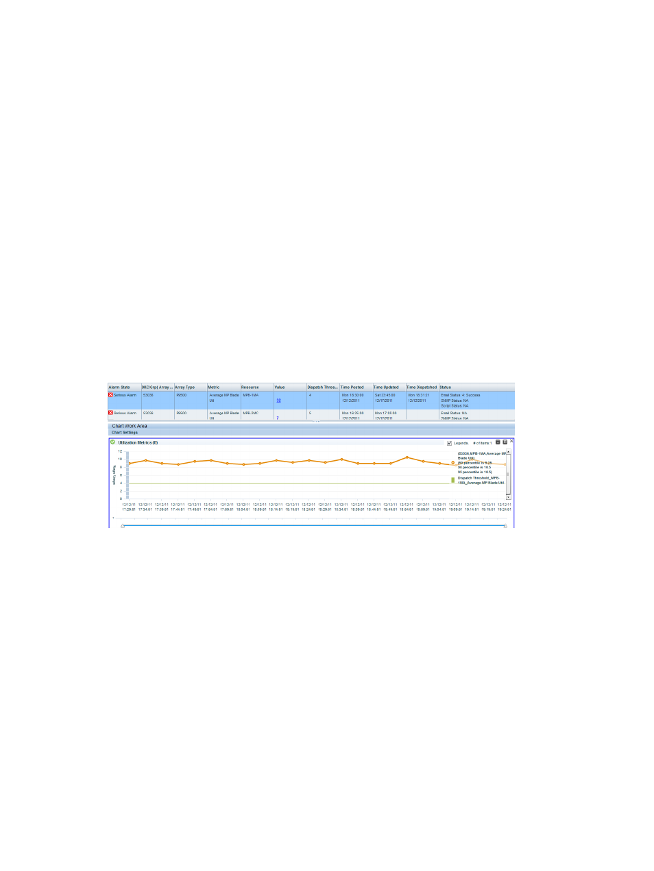
or dropped below the threshold level. For a component that has crossed the threshold limit, the
performance graph includes the following:
•
Performance value when the component crossed or dropped below the threshold level.
•
Includes data collected 1 hour prior to the component crossing or dropping below the threshold
level.
•
Continues to show data collected upto 1 hour after the component crossed or dropped below
the threshold level (if performance data is available).
For a component that has dropped below the threshold limit, the performance graph includes the
following:
•
Performance value when the component dropped below the threshold level.
•
Includes data collected 1 hour prior to the component dropping below the threshold level.
•
Continues to show data collected up to 1 hour after the component dropped below the threshold
level (if performance data is available).
The data available displays the progress trend of the component. The performance value displayed
under Value is in sync with the time displayed under Time Updated. It implies that HP XP7
Performance Advisor retrieves the performance value for the time displayed under Time Updated.
The performance value is updated till the time the component's performance rises or drops below
the set threshold level. Once the performance value rises or drops below the threshold, a new
record is posted in the Alarms History table and a new graph is generated as, and when HP XP7
Performance Advisor retrieves the latest performance value.
The performance graph also displays the Dispatch Threshold value that is the threshold value for
which an alarm was configured to be dispatched. The Dispatch Threshold value is displayed for
only one component and metric combination. It is disabled if you choose multiple components and
metrics. The Dispatch Threshold value acts like a watermark and helps you to identify the maximum
threshold limit that was set and the current performance value of the component. Appropriate
legends are displayed to differentiate the component current value from the Dispatch Threshold
value. In the above image, the green line signifies the Dispatch Threshold value. After the
performance graphs are plotted, use the following chart options in the Chart Work Area. In addition,
resize and rearrange the chart windows in the Chart Work Area. For more information on using
the chart options, see
.
Related Topics
•
“Understanding alarms history” (page 132)
•
“Alarm History screen” (page 132)
•
“Filtering records in Alarms History table” (page 134)
•
“Adding or removing metric values” (page 119)
•
“Configuring notification and monitoring settings” (page 120)
Managing alarms history
137