Winpep 7 dialog boxes – Dynojet WinPEP 7 User Manual
Page 28
WinPEP 7 User Guide
C H A P T E R 2
WinPEP 7 Dialog Boxes
2-12
. . . . . . . . . . . . . . . . . . . . . . . . . . . . . . . . . . .
WINPEP 7 DIALOG BOXES
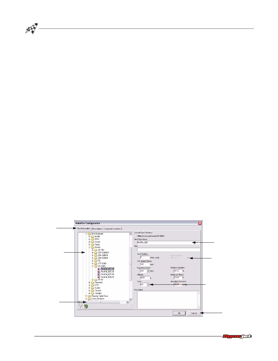
Many menu items display dialog boxes after you select them. An example is shown in
Figure 2-11. The dialog boxes in WinPEP 7 consist primarily of
, and buttons.
Page Tabs—Many dialog boxes provide multiple functions through tabs. By clicking a
tab icon, you can display different sets of controls.
Fields—A field is a rectangular box for entering a specific value or information. For
example, you can enter the run name in the Next Run Name field shown in Figure 2-
11.
You can use the tab key to highlight the next field in a dialog box and shift+tab to
highlight the previous field.
Drop-down Lists—A drop-down list is a small menu within a dialog box. A drop-
down list contains various options for you to choose from. Click on the arrow to
reveal the list.
Radio (Option) Buttons—A
lets you select options or turn options on
and off. Selecting a radio button may activate other controls and may expand a dialog
box to display more controls.
Check Boxes—A check box lets you turn options on and off. Selecting a check box
may activate other controls and may expand a dialog box to display more controls.
Buttons—A button performs an action. If a button has a bold outline, you can press
Enter when in any field of a dialog box to activate the button, rather than clicking the
button with your mouse. A button may also include a drop-down list that lets you
choose a type of action.
Figure 2-11: WinPEP 7 Dialog Box Features
page tab
tree view
scroll bar
button
field
drop-down list
radio button