Apple Keynote 3 User Manual
Page 139
Chapter 6
Creating Charts
139
To adjust the opacity of a chart:
m
Select the chart and drag the Opacity slider in the Graphic Inspector.
For more information, see “Adjusting Opacity” on page 88.
Area Charts and Line Charts
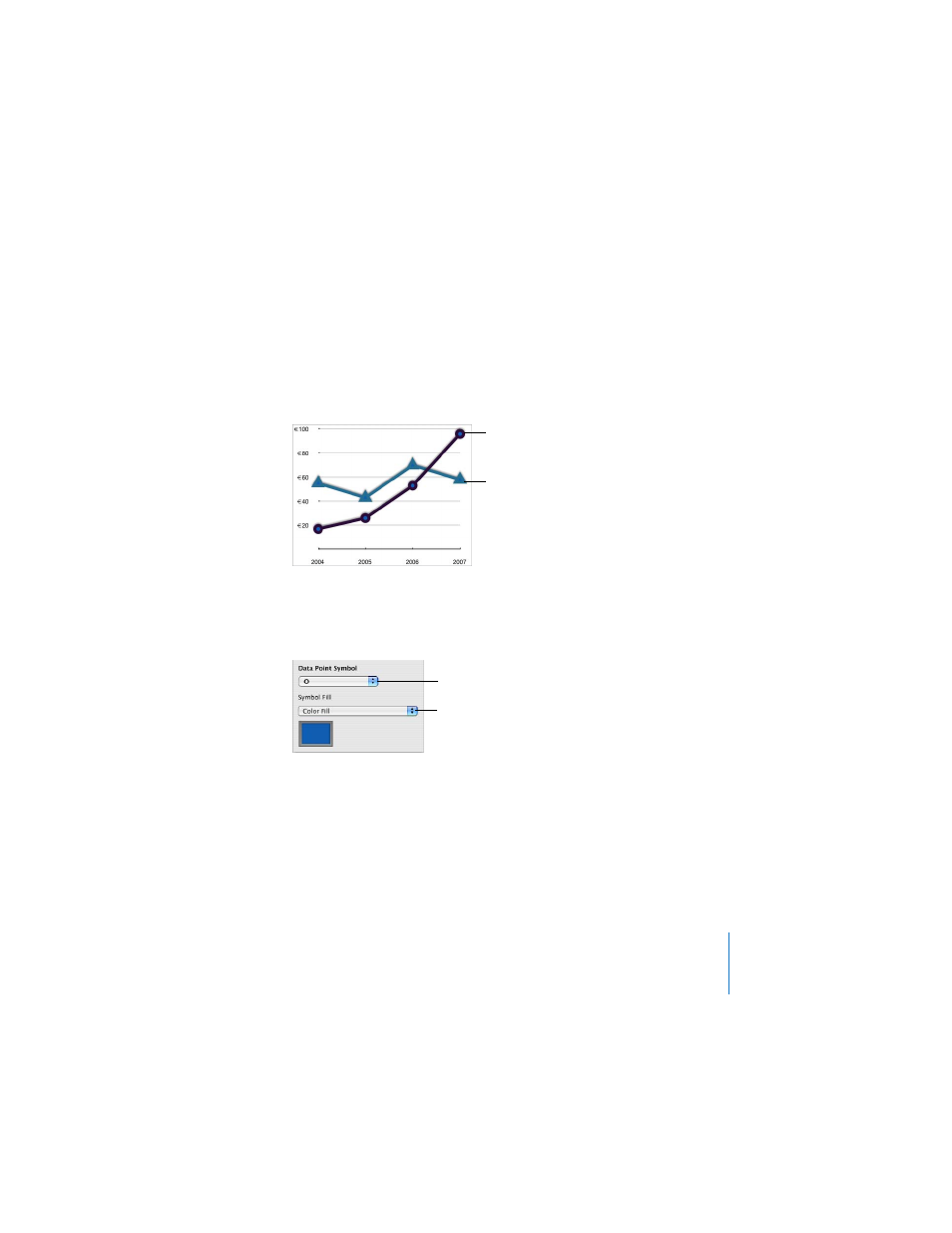
In area and line charts, you can use symbols—circles, triangles, squares, and
diamonds—to represent data points.
To use a symbol for the data points in a series:
1
Select a data series (area shape or line).
2
In the Series pane of the Chart Inspector, choose a symbol from the Data Point
Symbol pop-up menu.
3
Fill the symbol with color or an image by choosing one of the options in the Symbol
Fill pop-up menu.
For more information about using image fills, see “Using Color and Image Fills” on
To set the line color and shadow:
m
Use the Stroke and Shadow controls in the Graphic Inspector.
The data points in this
series are represented
with circles.
The data points in this
series are represented
with triangles.
Choose a symbol to use
for data points.
Fill data point symbols
with color or images.
- Numbers '09 (254 pages)
- Keynote '09 (247 pages)
- Pages '09 (279 pages)
- Boot Camp Mac OS X v10.6 Snow Leopard (18 pages)
- Boot Camp Mac OS X v10.6 Snow Leopard (19 pages)
- iWork '09 (372 pages)
- Mac OS X v10.6 Snow Leopard (7 pages)
- GarageBand '08 (102 pages)
- iDVD '08 (35 pages)
- GarageBand '09 (122 pages)
- iWeb (37 pages)
- iMovie '08 (50 pages)
- Boot Camp (Mac OS X v10.5 Leopard) (27 pages)
- Boot Camp (Mac OS X v10.5 Leopard) (25 pages)
- Mac OS X v10.5 Leopard (16 pages)
- Mac OS X (622 pages)
- Mac OS X Server (Version 10.6 Snow Leopard) (197 pages)
- Mac OS (42 pages)
- Mac OS X Server (Upgrading and Migrating For Version 10.4 or Later) (97 pages)
- iMovie HD (47 pages)
- iMovie HD (83 pages)
- MAC OS 7.6.1 (4 pages)
- Mac OS X Server (Extending Your Wiki Server For Version 10.5 Leopard) (45 pages)
- Mac OS X Server Ver 10.4 (35 pages)
- Mac OS X Server v10.6 (97 pages)
- Mac OS X Server v10.6 (76 pages)
- Macintosh Japanese Language Kit (30 pages)
- Xserve (Early 2008) DIY Procedure for Hard Drive (3 pages)
- Xserve (8 pages)
- Xserve (60 pages)
- GarageBand 3 (98 pages)
- Remote Desktop 3.1 (191 pages)
- Motion 5.1.1 (1090 pages)
- Workgroup Server 8150/110 (144 pages)
- Aperture (476 pages)
- Xserve Intel (Late 2006) DIY Procedure for Optical Drive Cable (7 pages)
- Xserve Intel (Late 2006) DIY Procedure for Optical Drive Cable (6 pages)
- Network Services Location Manager Network (8 pages)
- Macintosh System 7.5 (114 pages)
- Macintosh System 7.5 (65 pages)
- Macintosh System 7.5 (126 pages)
- DVD Studio Pro 4 (656 pages)
- Keynote '08 (204 pages)
- Xsan 2 (Second Edition) (11 pages)
- LiveType 2 (157 pages)