Apple Keynote 3 User Manual
Page 133
Chapter 6
Creating Charts
133
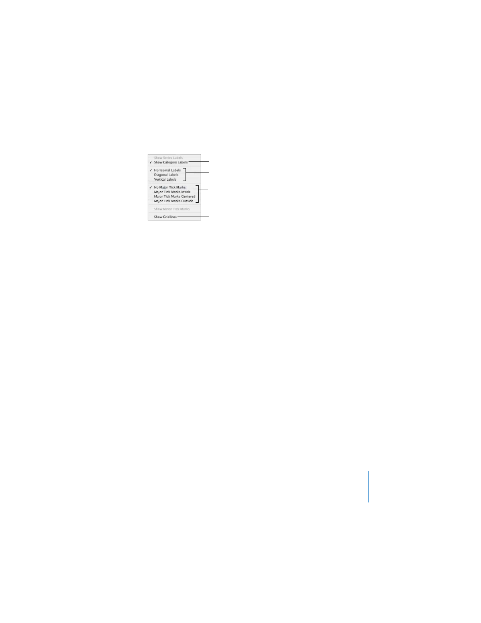
To show or hide axes and chart borders:
1
Select the chart.
2
In the Chart Inspector, click the Axis button if it is not already selected.
3
Choose one or more items in the Axes & Borders pop-up menu to select it.
A selected item has a checkmark next to it; choose the item again to deselect it.
To set the range of numerical values displayed on the chart grid:
1
Select the chart.
2
In the Chart Inspector, click the Axis button if it is not already selected.
3
To set the value at the chart origin, type a number in the Minimum field (below Value
Axis Format).
The Minimum value cannot be higher than the minimum value of your entire data set.
4
To set the highest number displayed on the value axis, type a number in the
Maximum field.
The Maximum value cannot be lower than the maximum value of your entire data set.
5
To specify the number of axis markings between the minimum and maximum values,
type a number in the Steps field.
To display the minimum data value on the value axis:
1
Select the chart.
2
In the Chart Inspector, click the Axis button if it’s not already selected.
3
Select Show Value Labels and Show Minimum Value from the value axis pop-up menu
(the X- or Y-axis pop-up menu, depending on the chart).
An item is selected when it has a checkmark next to it.
Place tick marks along
the X-axis.
Show or hide the
X-axis gridlines.
Set the text direction for
the series axis labels.
Show or hide axes and chart borders
(2D charts only).