Dashboard screen – HP XP P9000 Performance Advisor Software User Manual
Page 117
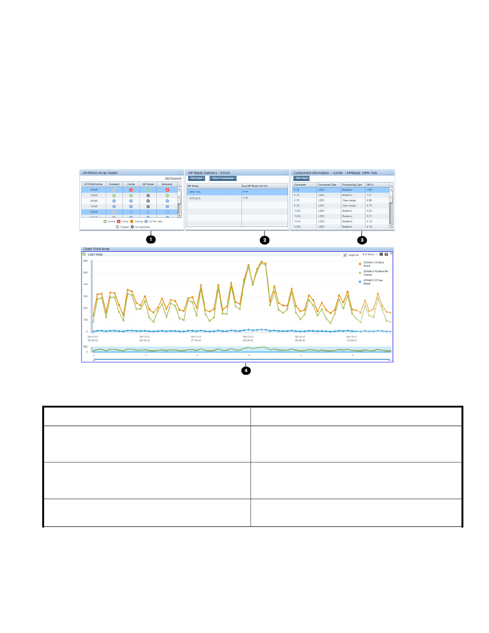
2.
Click a status icon in the Frontend, Cache, Backend, or the MP Blade (applicable only for the
P9000 disk arrays) category in the XP/P9000 Array Health section to view the corresponding
average usage summary of individual components in the Statistics section. For more information,
see “
3.
Select components and associated metrics in the Statistics section to plot the corresponding usage
graphs in the Chart Work Area. For more information, see “
You can select a component and click Show Consumers to view the maximum and least X busiest
components associated with a port, RAID group, or an MP blade. For more information, see
“
Specifying the top 20 consumers
4.
The Chart Work Area displays the usage pattern of components for the selected metrics and
threshold duration. It also displays the high watermark, which indicates the highest average usage
value of a particular component during the threshold duration. For more information, see
“
Figure 7 Dashboard screen
.
The Threshold Setting screen where you set the threshold levels.
1
The XP/P9000 Array Health section, where status icons are
displayed that indicate the overall usage of the XP and the P9000
disk arrays in a particular category.
2
The Statistics section, where the average usage summary of
individual components are displayed. You can plot their usage
graphs in the Chart Work Area.
3
The Chart Work Area, where graphs depicting the usage pattern
of individual components for selected metrics are displayed.
4
HP StorageWorks P9000 Performance Advisor Software User Guide
117