Formatting the elements in a data series – Apple Pages 2 User Manual
Page 210
210
Chapter 9
Creating Charts
3
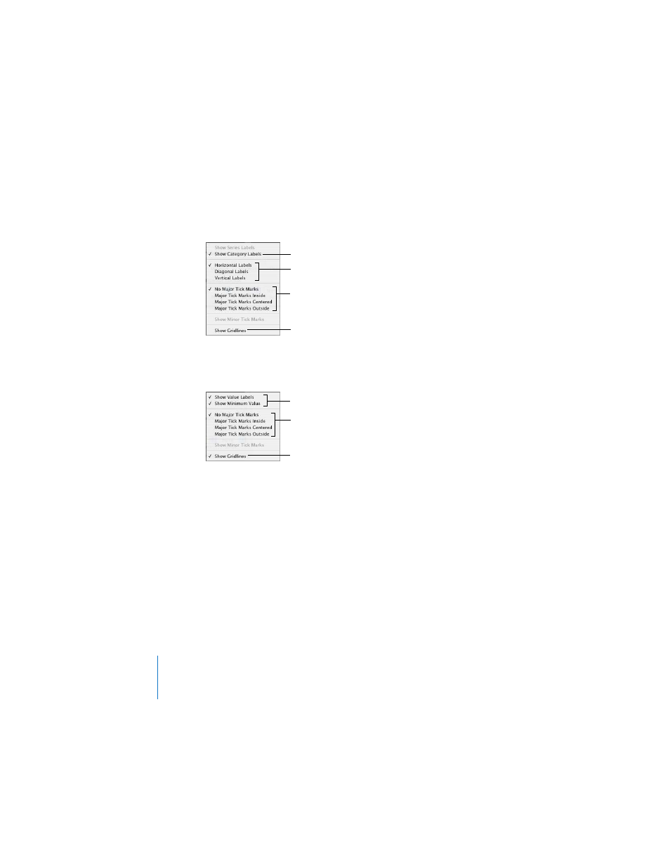
To add grid labels and tick marks along the X-axis, choose an option from the X-Axis
pop-up menu. The menu for a column chart looks like this:
4
To add grid labels and tick marks to the Y-axis, choose an option from the Y-Axis pop-
up menu. Here’s what the menu looks like for a column chart:
Formatting the Elements in a Data Series
You can use a variety of visual effects to enhance the appearance of data series
elements.
To add data point labels:
1
Select the chart or an element in a data series.
For all chart types except pie charts, selecting one element (such as a bar) of a series
automatically selects the full series. For pie charts, you can select individual wedges.
2
In the Chart Inspector, click the Series button.
3
Choose Show Value from the Data Point Label pop-up menu.
Place tick marks along
the X-axis.
Show or hide the
X-axis gridlines.
Set the text direction for
the series axis labels.
Show or hide series
axis labels.
Place tick marks along
the Y-axis.
Show or hide the Y-axis
gridlines.
Show or hide value axis
labels.
- Numbers '09 (254 pages)
- Keynote '09 (247 pages)
- Pages '09 (279 pages)
- Boot Camp Mac OS X v10.6 Snow Leopard (18 pages)
- Boot Camp Mac OS X v10.6 Snow Leopard (19 pages)
- iWork '09 (372 pages)
- Mac OS X v10.6 Snow Leopard (7 pages)
- GarageBand '08 (102 pages)
- iDVD '08 (35 pages)
- GarageBand '09 (122 pages)
- iWeb (37 pages)
- iMovie '08 (50 pages)
- Boot Camp (Mac OS X v10.5 Leopard) (27 pages)
- Boot Camp (Mac OS X v10.5 Leopard) (25 pages)
- Mac OS X v10.5 Leopard (16 pages)
- Mac OS X (622 pages)
- Mac OS X Server (Version 10.6 Snow Leopard) (197 pages)
- Mac OS (42 pages)
- Mac OS X Server (Upgrading and Migrating For Version 10.4 or Later) (97 pages)
- iMovie HD (83 pages)
- iMovie HD (47 pages)
- MAC OS 7.6.1 (4 pages)
- Mac OS X Server (Extending Your Wiki Server For Version 10.5 Leopard) (45 pages)
- Mac OS X Server Ver 10.4 (35 pages)
- Mac OS X Server v10.6 (76 pages)
- Mac OS X Server v10.6 (97 pages)
- Macintosh Japanese Language Kit (30 pages)
- Xserve (Early 2008) DIY Procedure for Hard Drive (3 pages)
- Xserve (8 pages)
- Xserve (60 pages)
- GarageBand 3 (98 pages)
- Remote Desktop 3.1 (191 pages)
- Motion 5.1.1 (1090 pages)
- Workgroup Server 8150/110 (144 pages)
- Aperture (476 pages)
- Xserve Intel (Late 2006) DIY Procedure for Optical Drive Cable (7 pages)
- Xserve Intel (Late 2006) DIY Procedure for Optical Drive Cable (6 pages)
- Network Services Location Manager Network (8 pages)
- Macintosh System 7.5 (65 pages)
- Macintosh System 7.5 (126 pages)
- Macintosh System 7.5 (114 pages)
- DVD Studio Pro 4 (656 pages)
- Keynote '08 (204 pages)
- Xsan 2 (Second Edition) (11 pages)
- LiveType 2 (157 pages)