Adding a chart – Apple Pages 2 User Manual
Page 201
Chapter 9
Creating Charts
201
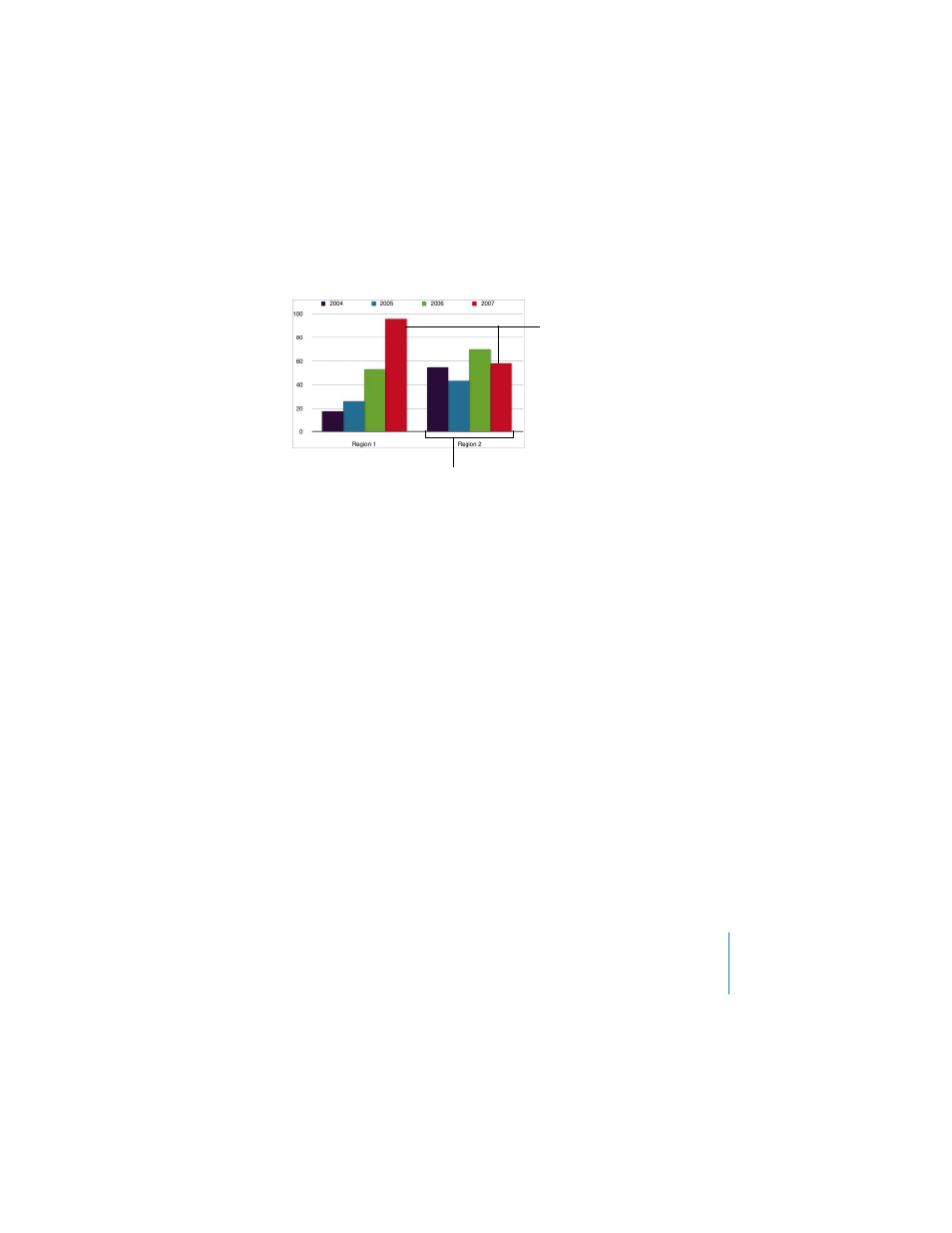
For this chart, the data series are represented by columns in the Chart Data Editor
pictured earlier. There are now four data series represented as four different-colored
bars.
Data series are represented differently in the different kinds of charts provided by
Pages.
 In column charts and bar charts, a data series is represented by a series of bars in
the same color (as shown above).
 In a line chart (also called a graph), a data series is represented by a single line.
 In an area chart, a data series is represented by an area shape.
 In a pie chart, only a single data set—the first data point in each series—is
represented on the chart (whichever is listed first in the Chart Data Editor).
 In a scatter chart, two columns of data are used to plot values for a single data
series. Each pair of values determines the position of one data point.
Adding a Chart
Charts can be added inline with text or fixed on the page. (To learn about fixed and
inline objects, see “Fixed Objects Versus Inline Objects” on page 124.) After you have
added the chart to the page, you can change the chart type and format it by using
the Chart Inspector, pictured later in this chapter.
These two bars represent
one data series.
The data sets contain
one data point (one bar)
from each of the four
data series.