Apple Keynote 1 User Manual
Page 73
72
Chapter 6
Selecting the checkbox also allows you to apply opacity to each data series. If you deselect
the checkbox, you can only adjust the opacity of all the elements on the chart together. To
read about changing opacity of objects, see “Adjusting Opacity” on page 52.
To adjust spacing between individual bars or data sets:
1
Select the chart.
2
In the Chart Inspector, type a percentage value in the “Gap between bars” field to increase or
decrease the space between the individual data elements.
3
Type a percentage value in the “Gap between sets” field to increase or decrease the space
between the data sets. The value you enter is the percentage of the bar thickness.
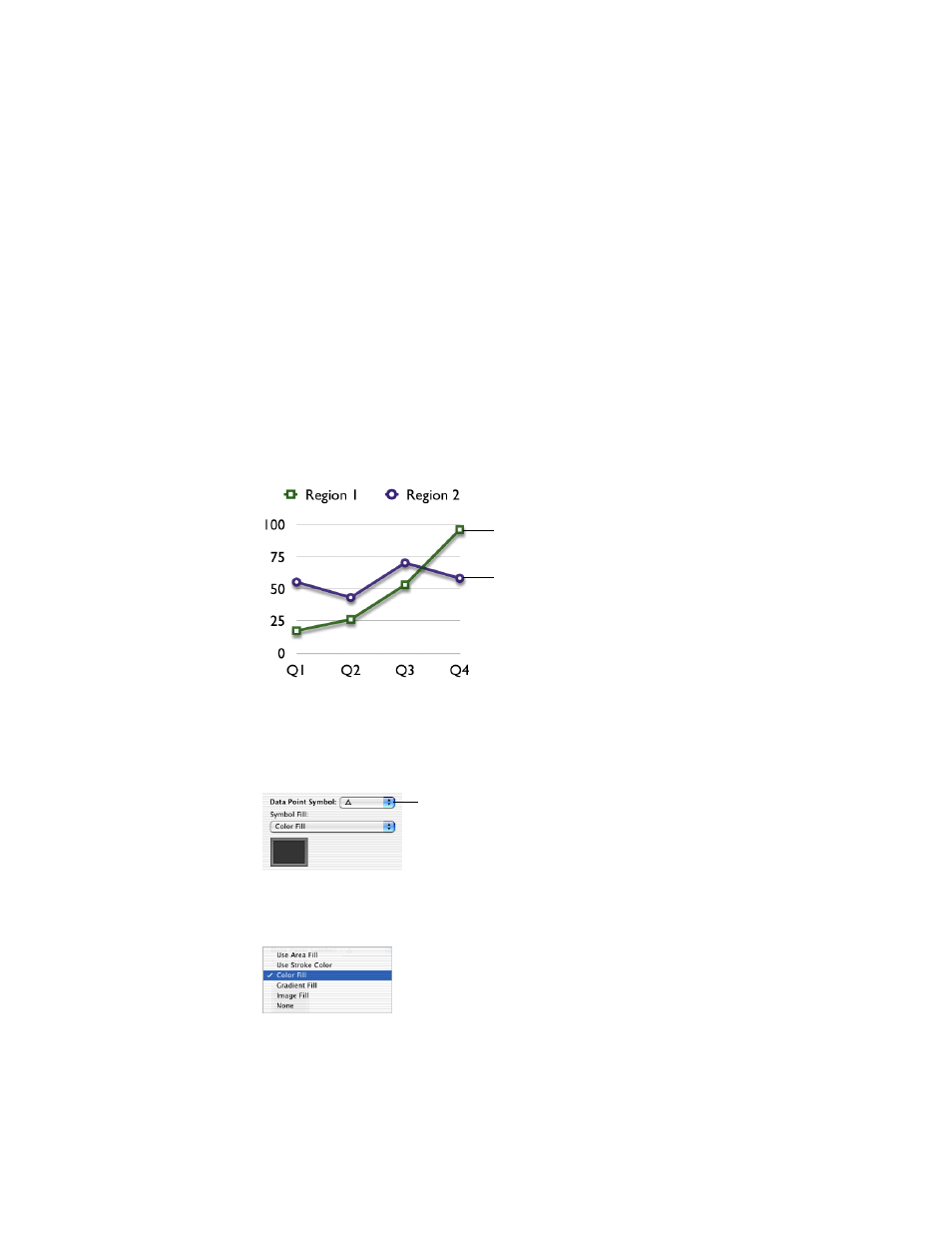
Area Charts and Line Charts
In area and line charts, data points can be denoted by symbols: circles, squares, triangles, and
so on.
To denote the data points using a symbol:
1
Choose a data series (area shape or line).
2
In the Chart Inspector, choose a symbol from the Data Point Symbol pop-up menu.
3
Format the symbol by choosing one of the options in the Symbol Fill pop-up menu, shown
below.
The data points in this series
are denoted by squares.
The data points in this series are
denoted by circles.
Choose a symbol to
denote the data points.