Adding labels and axis markings, Adding labels and axis markings 67 – Apple Keynote 1 User Manual
Page 68
Creating Charts
67
Adding Labels and Axis Markings
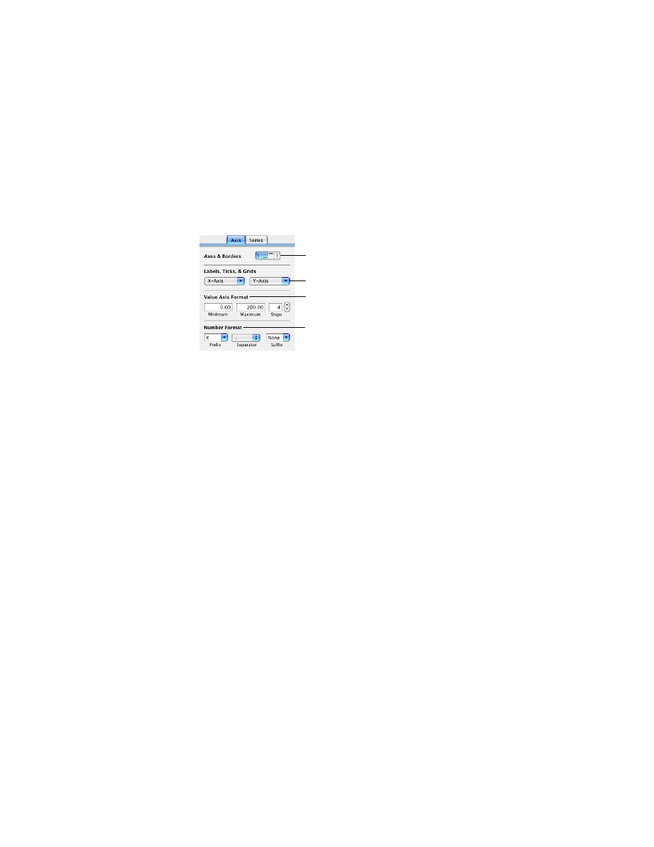
Use the Axis pane in the Chart Inspector to format the grid and general look of the axes for
bar charts, line charts, and area charts. You can set the range of values to be displayed along
the value axis, the axis from which you read the data point values. For column charts
(vertical bars), line charts, and area charts, the Y-axis is the value axis. For horizontal bar
charts the X-axis is the value axis. Pie charts do not have a value axis. To read about
formatting pie charts, see “Pie Charts” on page 69.
To show or hide chart borders:
1
Select the chart.
2
Click the Axes & Borders buttons in the Axes pane of the Chart Inspector to show or hide the
corresponding chart borders.
To set the range of numerical values displayed on the chart grid:
1
Select the chart.
2
In the Chart Inspector, type a number in the Minimum field under Value Axis Format. This
will be the value at the chart origin. The minimum value cannot be higher than the minimum
value of your entire data set.
3
Type a number in the Maximum field. This will be the highest number displayed on the grid.
It cannot be lower than the highest value in your data set.
4
Type a number in the Steps field. This marks the axis with values at equal intervals. The
number of steps you specify determines the number of axis markings.
To specify units for axis values:
1
Select the chart.
2
Type text or a text symbol in the Prefix or Suffix field under Number Format (or choose a
symbol from the pop-up menus).
In the Prefix and Suffix fields, you cannot use the characters 0 through 9, nor the comma (,),
period (.), or number sign (#).
Set styles for labels and tick
marks along the chart grid.
Select units for values
in the chart.
Show or hide chart borders.
Set the range of values that
appear on the chart grid.