Transposing data series and data sets, Transposing data series and data sets 63 – Apple Keynote 1 User Manual
Page 64
Creating Charts
63
2
Place the pointer over the right or left edge of the column. The pointer becomes a vertical
line flanked by arrows pointing in opposite directions.
3
Drag the border to make the column wider or narrower.
To add rows or columns in the Chart Data Editor:
m Click Add Row or Add Column to place a row above the selected row or a column to the
left of the selected column. If no row or column is selected, the new row or column will
appear at the bottom or right edge of the table. You may have to press the Return key or
the Tab key to see the new row or column.
m Select any blank cell and type your data. A new row or column is automatically created.
To delete rows or columns:
m Select the row or column label and press Delete.
Transposing Data Series and Data Sets
Charts show the relationship of two types of data with respect to each other. For example, if
you chart business growth over time, you are showing the relationship between the size of
the business versus the passage of years. If you chart voting results among different
demographic groups, you are showing the relationship between the number of people who
voted a certain way versus their demographic affiliation. When you enter data for a chart, the
two different types of data are represented as data series and data sets.
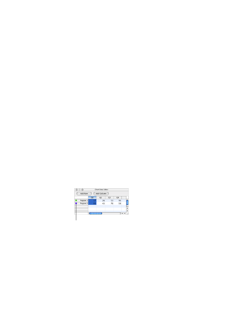
In a business chart, an example of a data series could be the profits for one region over four
successive quarters; the data sets could be all the regional profits for only one of those
quarters. In the illustration below, the data series (each region’s profits) are in rows, and the
data sets (each quarter’s profits) are in columns. Each individual value (for example, 17 for
Region 1, Q1) is a data point.
Notice the colored marks next to the row labels (Region 1 and Region 2). These marks show
the colors that will represent the data series in the chart.
These marks indicate the colors that
represent each data series.