Formatting charts, Formatting charts 65 – Apple Keynote 1 User Manual
Page 66
Creating Charts
65
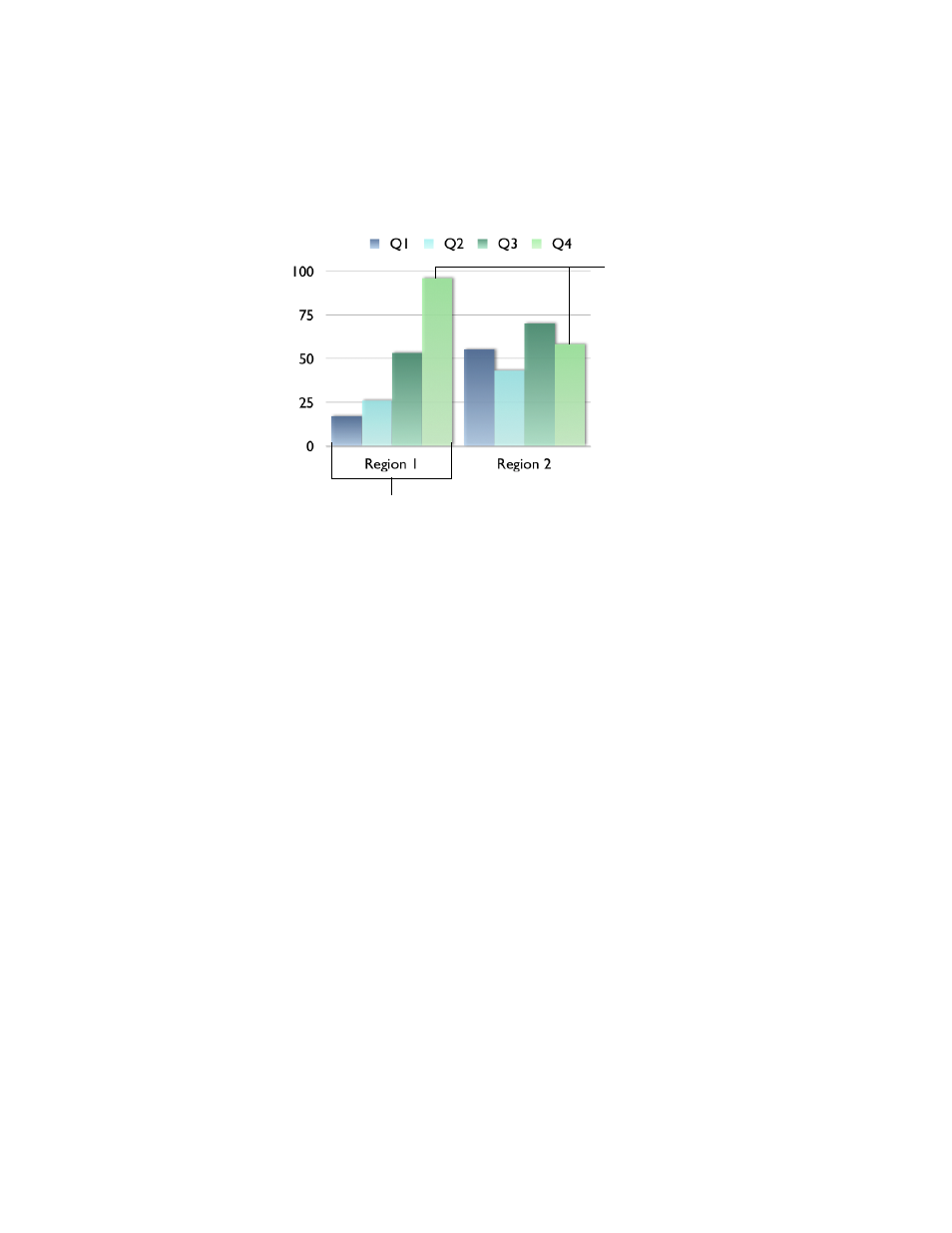
The illustration below shows how the same data shown earlier would appear in a column
chart if you transposed the data sets and data series.
For this chart, the data series are now represented by columns in the Chart Data Editor
pictured on page 63. There are now four data series represented as four different-colored
bars.
In column charts and bar charts, a data series is represented by a series of bars in the same
color (as shown above). In a line chart, a data series is represented by a single line. In an area
chart, a data series is represented by an area shape. For pie charts, only a single data set—the
first data point in each series—is represented on the chart (whichever is listed first in the
Chart Data Editor).
Transposing data series and data sets between rows and columns makes it easy to present
your data to best effect without having to retype the data.
Formatting Charts
The elements of any chart can be formatted to fit your preferences. You can change the fonts,
colors, and markings along the axes. You can also choose to show or hide the chart legend
on your slide. Most of the chart formatting tasks are done using the Chart Inspector.
To open the Chart Inspector:
1
Choose View > Show Inspector (or click Inspector in the toolbar).
2
In the Inspector window, click Chart.
To show the chart legend:
1
Select the chart.
These two bars represent
one data series.
The data sets contain one data point (one
bar) from each of the four data series.