Baseline Systems BaseStation 6000 User Manual
Page 75

P a g e
| 67
If the actual usage is greater than the planned usage on a specific day, the difference should be represented by any manual
and/or unplanned usage.
On the Actual vs. Planned graph, you can drill into more detail for a particular day by clicking one of the graphed bars for that
day. The graph expands to show the data on an hourly scale. Click one of the bars again to see the data for that hour. To return
to the previous view of the data, click Back to Previous Screen.
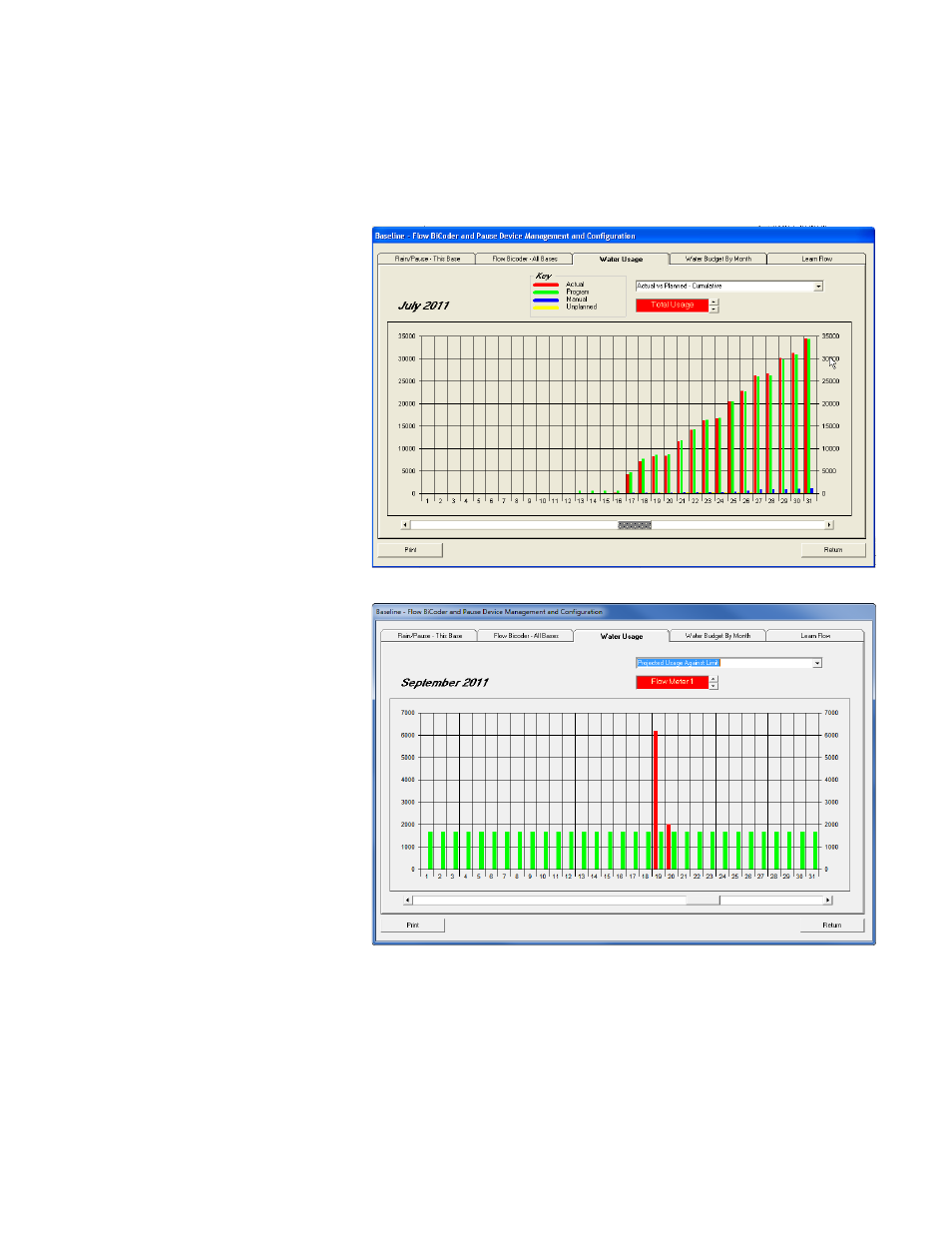
Actual vs. Planned – Cumulative – This
graph shows the sum total of water usage
per day.
On the Actual vs. Planned – Cumulative
graph, you can drill into more detail for a
particular day by clicking one of the
graphed bars for that day. The graph
expands to show the data on an hourly
scale. Click one of the bars again to see the
data for that hour. To return to the previous
view of the data, click Back to Previous
Screen.
Projected Usage Against Limit – This graph
shows the planned usage represented by
the green bars compared with the actual
usage recorded by the flow meter
represented by the red bars.
