Adjusting the data view on a graph, Adjusting the data view, On a graph – Baseline Systems BaseStation 6000 User Manual
Page 101: 93 fo, O adjusting the data view on a graph, E 93 fo

P a g e
| 93
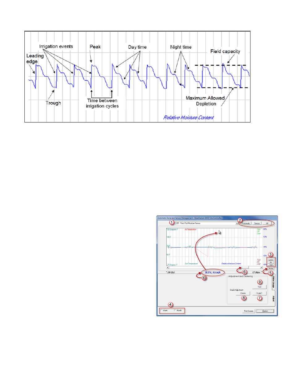
Moisture levels drop more sharply during day time than during night time due to higher temperatures.
When a soil moisture sensor detects a steady increase in moisture levels during an irrigation event, the leading edge of the
graph is sharp and clean. If the leading edge is jagged, it means that moisture levels increased erratically during (or after) the
irrigation event. This situation might occur if the sensor is buried too deeply or if the irrigation event applies water too quickly.
A sharp peak on graph means that the moisture level rose to a certain level and then the soil started to dry out normally. A
rounded peak means that moisture is being held in the soil after the cycle is complete and some time passes before the
moisture starts to decrease.
The trough represents the initial drying out. If you have a lower threshold set, the trough represents the maximum allowed
depletion of moisture in the soil and the point where another irrigation event is initiated.
Adjusting the Data View on a Graph
When you display a soil moisture graph, you can adjust the view of the data on the graph.
(1)
Selected sensor – This field shows the sensor for
which data is being displayed on the graph.
(2)
Data view – Click these buttons to switch between the
view that shows just the sensor data (Sensor), the view
that shows the graph and tools for managing the auto
zone (Automatic) and the view that shows all your
zones (All).
(3)
Data that is graphed – Click these buttons to display or
hide the lines representing the data on the graph.
Color key for graph lines –The words Air Temperature,
Turn Off Limit, Turn On Limit, Relative Moisture
Content, and Soil Temperature are displayed around
the edges of the graph. These words refer to the graph
lines and the color of the word matches the color of
the corresponding graph line.
(4)
Data range – Click these buttons to change the range of data. You can also toggle between the data ranges by clicking in
the graph. Notice that the actual dates for the date range are displayed at the lower-left and lower-right corners of the
graph.
