B&G Deckman User Manual
Page 80
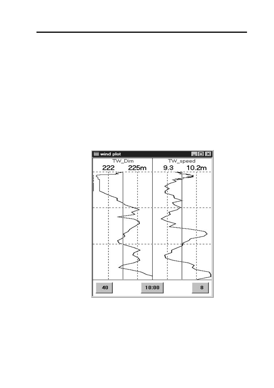
Wind Plot
5.3
Figure 5.2
Choose data>wind plot from the icon bar to see the wind plot—an
example is shown in Figure 5.2. The line down the centre of each graph
shows you the average or mean value calculated over the time period of
the graph. The value of the mean is shown at the top of the display with
the m appended to it (225° and 10.2 in the example); the other number is
the present value (222° and 9.3). As time progresses the graph moves
down and across the display so that it stays centred with respect to the
mean. So a glance at this display will tell you immediately whether the
wind is lifted or headed compared to the longer trend. You will notice
that the direction is still displayed correctly even when it is varying
around North. When you are on starboard an extra vertical line is drawn
against the left hand boundary of the display.
The three buttons at the bottom of the display control the appearance of
the graph: the button on the left specifies the range for the display of the
true wind direction across the whole graph (40° in the example, i.e. 20°