Apple Numbers '08 User Manual
Page 111
Chapter 6
Using Charts
111
For vertical bar charts (column charts), line charts, and area charts, the Y-axis is the
value axis and the X-axis is the category axis. For horizontal bar charts, the X-axis is the
value axis. For scatter charts, both axes are value axes. For 3D charts, the X and Y axes
are the same as their 2D counterparts.
To format axis markings:
1
Select the chart.
2
Click Inspector in the toolbar, click the Chart Inspector button, and then click Axis.
3
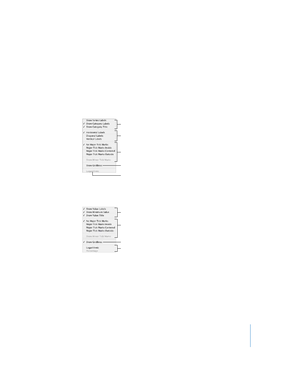
To format the X-axis, choose an option from the X-Axis pop-up menu. The menu for a
column chart looks like this:
4
To format the Y-axis, choose an option from the Y-Axis pop-up menu. Here’s what the
menu looks like for a column chart:
5
To edit axis labels based on header column or row values, select the table and edit the
labels.
If you want axis labels to differ from header column or row values, select the chart and
edit the labels. Changing header cells no longer affects the axis labels after you edit the
labels in the chart.
Place tick marks along the
X-axis.
Show or hide the X-axis
gridlines.
Set the text direction for
the category axis labels.
Show or hide category
axis labels and title.
Display values as
logarithmic values.
Place tick marks along the
Y-axis.
Show or hide the Y-axis
gridlines.
Show or hide value axis labels.
Display values as logarithmic
values or percentages.