Apple Numbers '08 User Manual
Page 100
100
Chapter 6
Using Charts
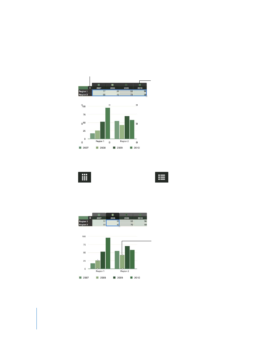
When you select a chart, the cells plotted in it are highlighted in the related table. In
addition, colored squares appear next to columns and rows in the table to show which
color represents each data series in the chart.
A button in the upper left of the table lets you switch between using columns and
rows as data series.
You can also click a series element in the chart to view its related data in the chart and
the underlying table.
Click this button to change
the chart orientation.
These squares indicate
which color represents
each data series.
When the button looks like this,
the columns are data series.
Click the button to make rows
the data series.
When the button looks like this,
the rows are data series. Click
the button to make columns
the data series.
Selecting a bar highlights
bars in the chart in the
same data series as well as
related values in the
underlying table.
- Numbers '09 (254 pages)
- Keynote '09 (247 pages)
- Pages '09 (279 pages)
- Boot Camp Mac OS X v10.6 Snow Leopard (18 pages)
- Boot Camp Mac OS X v10.6 Snow Leopard (19 pages)
- iWork '09 (372 pages)
- Mac OS X v10.6 Snow Leopard (7 pages)
- GarageBand '08 (102 pages)
- iDVD '08 (35 pages)
- GarageBand '09 (122 pages)
- iWeb (37 pages)
- iMovie '08 (50 pages)
- Boot Camp (Mac OS X v10.5 Leopard) (27 pages)
- Boot Camp (Mac OS X v10.5 Leopard) (25 pages)
- Mac OS X v10.5 Leopard (16 pages)
- Mac OS X (622 pages)
- Mac OS X Server (Version 10.6 Snow Leopard) (197 pages)
- Mac OS (42 pages)
- Mac OS X Server (Upgrading and Migrating For Version 10.4 or Later) (97 pages)
- iMovie HD (47 pages)
- iMovie HD (83 pages)
- MAC OS 7.6.1 (4 pages)
- Mac OS X Server (Extending Your Wiki Server For Version 10.5 Leopard) (45 pages)
- Mac OS X Server Ver 10.4 (35 pages)
- Mac OS X Server v10.6 (76 pages)
- Mac OS X Server v10.6 (97 pages)
- Macintosh Japanese Language Kit (30 pages)
- Xserve (Early 2008) DIY Procedure for Hard Drive (3 pages)
- Xserve (8 pages)
- Xserve (60 pages)
- GarageBand 3 (98 pages)
- Remote Desktop 3.1 (191 pages)
- Motion 5.1.1 (1090 pages)
- Workgroup Server 8150/110 (144 pages)
- Aperture (476 pages)
- Xserve Intel (Late 2006) DIY Procedure for Optical Drive Cable (7 pages)
- Xserve Intel (Late 2006) DIY Procedure for Optical Drive Cable (6 pages)
- Network Services Location Manager Network (8 pages)
- Macintosh System 7.5 (114 pages)
- Macintosh System 7.5 (65 pages)
- Macintosh System 7.5 (126 pages)
- DVD Studio Pro 4 (656 pages)
- Keynote '08 (204 pages)
- Xsan 2 (Second Edition) (11 pages)
- LiveType 2 (157 pages)