Properties of tree control – Adobe Extending Dreamweaver CS4 User Manual
Page 317
311
EXTENDING DREAMWEAVER CS4
Components
Note: Keep the same prefix throughout all the files that correspond to one component so that each file and its
corresponding component can be identified easily.
2
Write the JavaScript code to implement the new server component.
The extension file (HTM) defines the locations of the JavaScript code in the
SCRIPT
tag. These JavaScript files can
reside in the Shared folder, in the same folder as the extension file, or in the Common folder for code that applies to
multiple server models.
For example, the WebServices.htm file in the Configuration/Components/Common/WebServices/ folder contains the
line:
For more information on the available Component API functions, see “
Components panel API functions
When adding a new service, you might want to use the Components panel to browse meta information so that the
information is readily available as you create the extension. Dreamweaver can browse added components and display
nodes in the component tree. The Components panel provides drag-and-drop support and keyboard support in Code view.
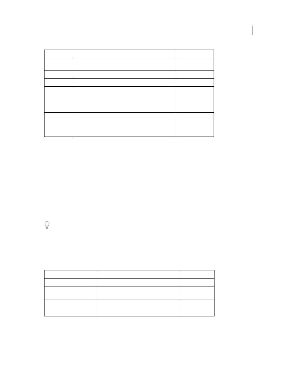
Properties of tree control
Use the
ComponentRec
property to populate a Components panel tree control, so that it appears within the
Components panel in the proper location. Every node in a tree control must have the following properties:
Filename
Description
Required/Optional
*.htm
The extension file that identifies other supporting JavaScript and
GIF files.
Required
*.js
The extension file that implements the Component API callback.
Required
*.gif
The image that appears in the Components pop-up menu.
Required
*Menus.xml
The repository for metadata that organizes the Components panel
structure. Although the common WebServices component does
not use this file, you can refer to the file WebServicesMenus.xml in
the application folder Components/ColdFusion/WebServices as an
example.
Optional
*.gif
Toolbar images, which can be enabled or disabled, as shown in the
following example:
ToolBarImageUp.gif
ToolBarImageDown.gif ToolBarImageDisabled.gif
or, tree node images.
Optional
Property name
Description
Required/Optional
name
Name of the tree node item
Required
image
Icon of the tree node item. If it is not specified, a default
icon is used.
Optional
hasChildren
Responds to clicks on the Plus (+) and Minus (-) buttons in
the tree control by loading children. You can work with a
tree that is not prepopulated.
Required