Difference curve chart – Bio-Rad Precision Melt Analysis™ Software User Manual
Page 41

Analyzing Melt Data
36
view is selected. The default value for the temperature shift bar height is specified in the
Analysis Options Manager window.
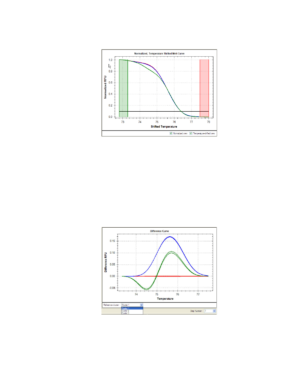
Figure 25. Temperature Shifted view option selected in Melt Curve chart.
TIP: To magnify any area of the Melt Curve chart, click and drag the mouse across
an area of the chart. To return the chart to a full view, right-click and select Set
Scale to Default from the menu.
Difference Curve Chart
For easy visual identification of clusters, Precision Melt Analysis software generates a
difference curve for each well (Figure 26). The Difference Curve chart shows the difference in
fluorescence between a well and the fluorescence of a reference curve. The reference curve is
derived from the average fluorescence of all the curves within a selected reference cluster.
Select the reference cluster from the Reference cluster menu under the Difference Curve
chart.
Figure 26. Reference cluster selection.
