Precision melt tab, Melt curve chart – Bio-Rad Precision Melt Analysis™ Software User Manual
Page 39

Analyzing Melt Data
34
Precision Melt Tab
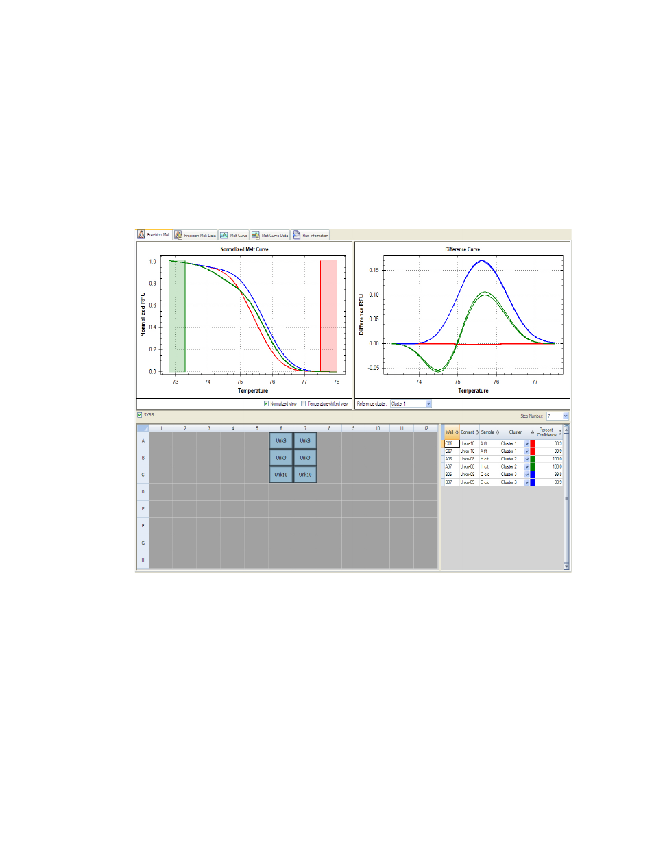
Use the data in the Precision Melt tab to set data analysis conditions, including normalization
and, if required, temperature shift. The Precision Melt tab shows data in four views (Figure 22):
•
Melt Curve chart. Shows the RFUs for each well plotted against temperature. Each
trace represents data from a single fluorophore in one well
•
Difference Curve chart. Shows the difference RFU plotted on the y-axis against
temperature on the x-axis
•
Well selector. Select the data you want to show
•
Spreadsheet. Shows a spreadsheet of the data for the selected wells
Figure 22. Layout for the Precision Melt tab in Data Analysis window.
NOTE: If the protocol includes more than one data collection step (camera icon),
select the step with the data you want to view in the Step Number menu below the
Difference Curve chart.
Melt Curve Chart
The Melt Curve chart shows RFUs plotted against temperatures for each well. The Melt Curve
chart contains multiple options for displaying the data.
