28 attributes of push button components, Attributes of push button components -53, App index – Yokogawa Removable Chassis DX1000N User Manual
Page 83: Name of each component, Attribute setting dialog, List of attributes

2-53
IM 04L41B01-04E
Advanced Settings of Screen and Component
1
2
3
App
Index
2.28 Attributes of Push Button Components
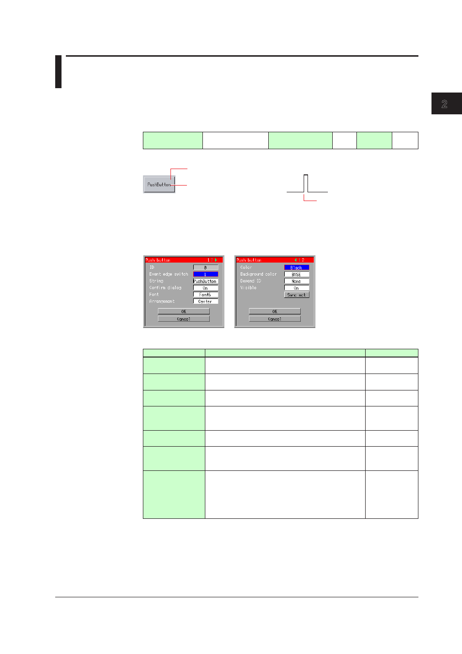
These components are used to display a push button. Using the action function allows
the event edge switch to be switched on the execution screen as shown in the figure
below.
Component type
(See Section 1.4.)
Components with
action functions
Overlap restriction
(See Section 1.4.)
None
Update
cycle
None
Name of Each Component
Background color
1
0
String
Event edge switch
Action execution
To execute the configured action on the execution screen, select a component using the
up and down arrow keys and press DISP/ENTER.
Attribute Setting Dialog
List of Attributes
Attribute
Description
Default value
ID
Number automatically assigned for component
identification.
0 to 79
Event edge
switch
Sets the event edge switch number. Selectable from [1]
and [30].
1
String
You can enter up to 64 one-byte characters, as the
string to be displayed on the button.
PushButton
Confirm dialog
Sets [On] or [Off] to indicate whether or not the
confirmation dialog is displayed during action
execution.
On
Font
Sets character size. Selectable from [Font 5], [Font 6],
[Font 8], [Font 12], [Font 16], and [Font 32].
Font 6(DX1000)
Font 8(DX2000)
Arrangement
Sets the horizontal arrangement of the string to be
displayed on the button. Selectable from [Center],
[Left], and [Right].
Center
Color
Set the color of the string.
Selectable from among [Red], [Green], [Blue], [B.violet],
[Brown], [Orange], [Y.green], [Lightblue], [Violet],
[Gray], [Lime], [Cyan], [Darkblue], [Yellow], [Lightgray],
[Purple], [Pink], [L.brown], [L.green], [Darkgray], [Olive],
[Darkcyan], [S.green], [Black], [White], and [BASE].
Black
Continued on next page
